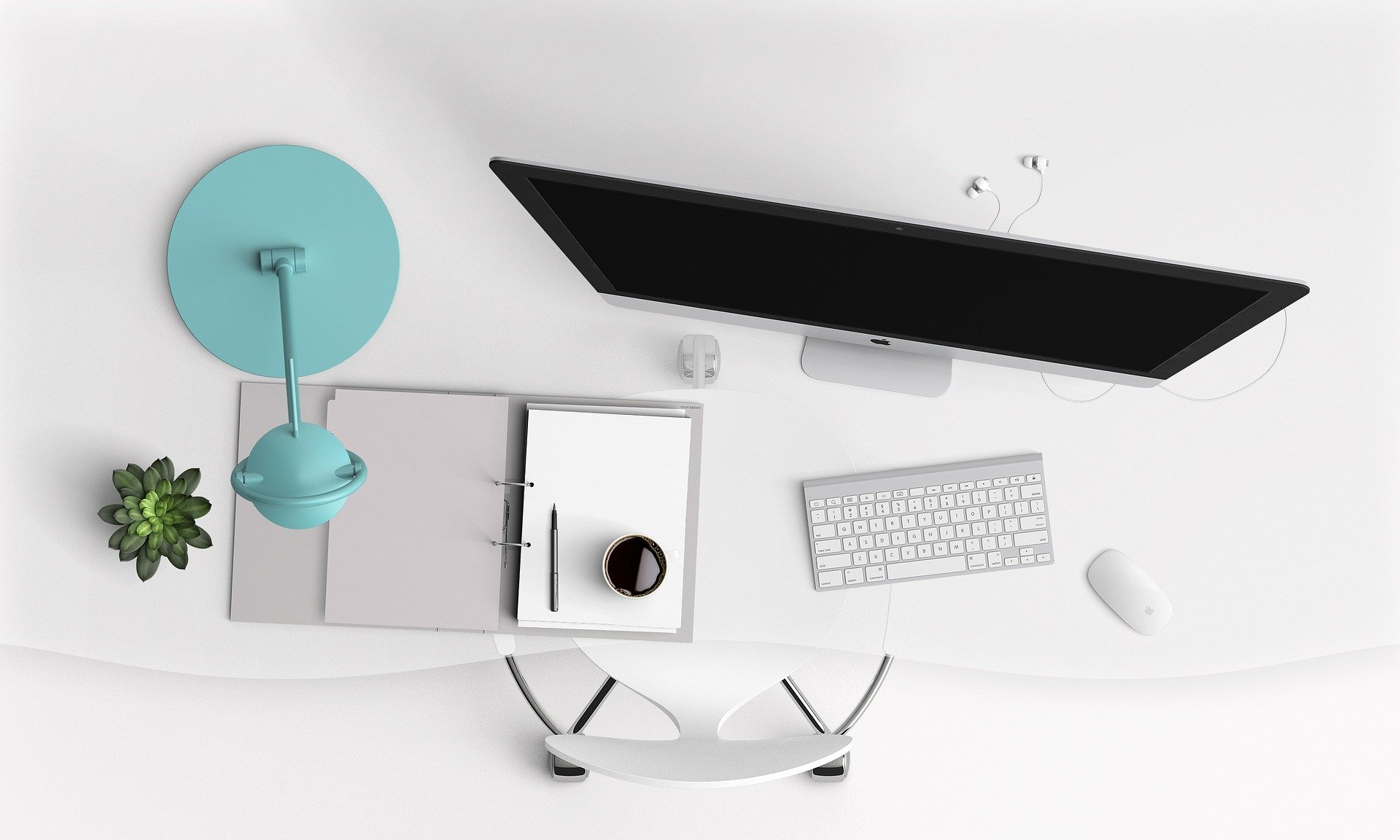
In a digital world overwhelmed by information, the minimalist web design trend has surged in popularity, emphasizing simplicity and user-friendliness. This approach to design is not just a passing fad; it reflects a broader shift toward clarity and purpose on the web.
The Appeal of Minimalism
Minimalist design is all about stripping away the unnecessary elements to focus on what truly matters. This results in clean, uncluttered interfaces that are easy to navigate, enhancing the user experience. The aesthetic appeal of minimalist design lies in its simplicity, which can make a website look more professional and trustworthy.
Key Elements of Minimalist Design
- Whitespace: The strategic use of whitespace (or negative space) allows content to breathe and gives the design an elegant, airy feel.
- Typography: With minimal distractions, typography plays a crucial role. Choosing the right fonts can convey the brand’s message effectively.
- Color Schemes: Simple, often monochromatic color schemes are a hallmark of minimalist design, though bold accent colors can be used to draw attention to key elements.
Minimalist web design aligns with the growing demand for faster-loading sites and mobile-first design. By reducing the number of elements, websites can load more quickly and perform better on various devices.
Minimalism in web design is more than just a trend; it’s a practical approach to creating visually appealing and highly functional websites. By focusing on the essentials, businesses can provide a superior user experience that drives engagement and conversions.
