Home › Forums › Trusted Pro › Header renders differently in Chrome
Tagged: custom header settings
- This topic has 6 replies, 2 voices, and was last updated 8 years, 1 month ago by
 Andy.
Andy.
-
AuthorPosts
-
March 8, 2018 at 11:48 pm #4084
Laurie
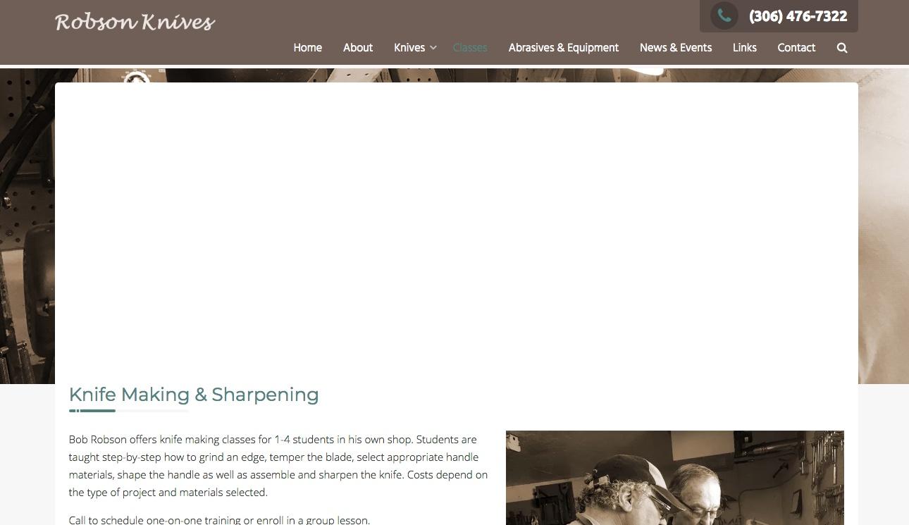
ParticipantA site I’m working on has a problem with the header image. In Safari, the pages render as you would expect; however, in Chrome the page text appears on top of the header image when it should render behind the image.
Here is how it looks in Safari:

Here’s the same page in Chrome:

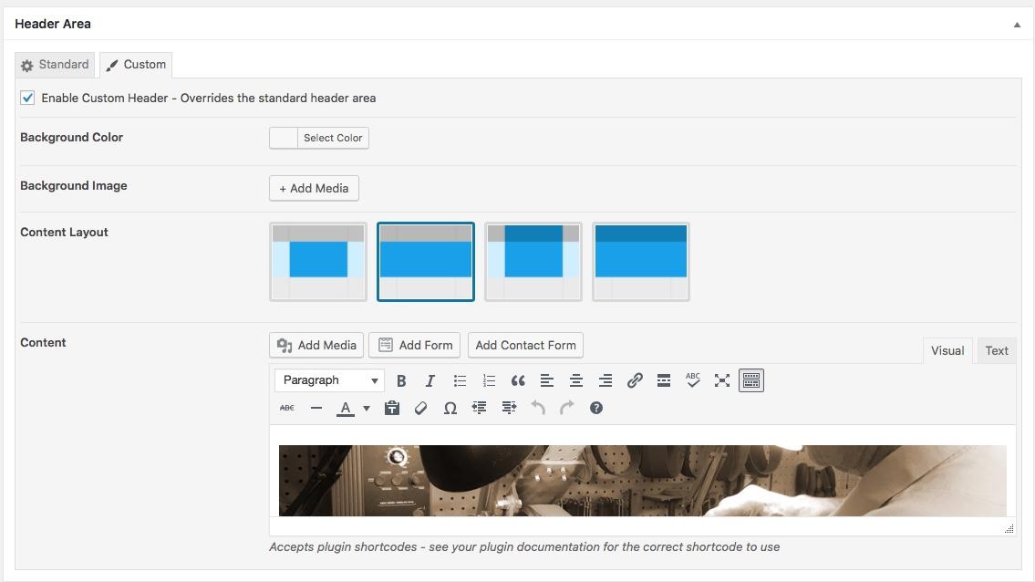
Here are the settings for the page:

It looks as expected in both browsers if I choose the first format or the 3rd, but the second doesn’t work. I’ve used this template with the same setting with no issues.

Do you know what is going on? I’m not sure if the problem is related, but I also wanted to put a colored background behind the header image so there would be no white line between the header photo and the menu bar. No matter what I did I could not get rid of the white line on this site. The other site where the header image renders correctly I was able to set the background color for the image.
Thanks.
March 9, 2018 at 8:54 am #4085 AndyKeymaster
I can’t be sure, but it looks like you have put your “background” image in the content area instead of using the Background Image option.
As you are just changing the background image, I would recommend that you use the Standard Header and add your image as the Background Image, as the height of the custom header will render based on the height of the content within the custom header.
The white line is because your image is wrapped within paragraph tags which have a 5px padding. The WordPress ‘Visual’ content editor automatically adds
<p></p>paragraph tags around text or images.March 9, 2018 at 9:11 am #4086 AndyKeymaster
Just one other thing to try if you want to keep the image in the content area.
For the image that you have placed in the content area of the custom header, can you try changing the image Alignment to either Center or None.
March 9, 2018 at 1:38 pm #4089Laurie
ParticipantYour second suggestion worked. I changed the alignment to “None” and everything worked. I could get rid of the white line as well. So, if someone wants to use a larger, distinct image on all of the pages: choose the custom header option; check the custom header box; place the header image in the content section of the header settings; and select “None” for alignment when importing the image. If you want to remove the white line, add the background color under the content section. Keep in mind, however, that you will have to add the page titles and icons to the image manually. You can do that by switching to the standard header option and grabbing a snapshot of the page title.

Thanks for your help!
March 9, 2018 at 5:58 pm #4090 AndyKeymaster
Hi Laurie,
Glad to hear that changing the image alignment fixed it.
I would offer some caution about using a screenshot of the page title, as doing it this way will result in there being no H1 page title on the page and will be not so good for SEO purposes (unless you manually write a H1 title into the page content).
March 10, 2018 at 12:30 pm #4091Laurie
ParticipantHi Andy,
Is there a better way to accomplish the same effect? I like the ability to have distinct, larger images on the secondary pages. The narrow image is too limiting for the content that I’m working with for these 3 websites.
March 10, 2018 at 9:30 pm #4093 AndyKeymaster
You can use the standard header and set a different background image on a page-by-page basis.
Then increase the top and bottom padding with this CSS snippet in Additional CSS
.header-title {
    padding: 200px 0;
}
The standard padding value is 70px, so 200 or any value above 70 would increase the size of the header area.
-
AuthorPosts
- The topic ‘Header renders differently in Chrome’ is closed to new replies.
