- This topic has 1 reply, 2 voices, and was last updated 5 years, 7 months ago by .
Viewing 2 posts - 1 through 2 (of 2 total)
Viewing 2 posts - 1 through 2 (of 2 total)
- The topic ‘Logo Size on mobile’ is closed to new replies.
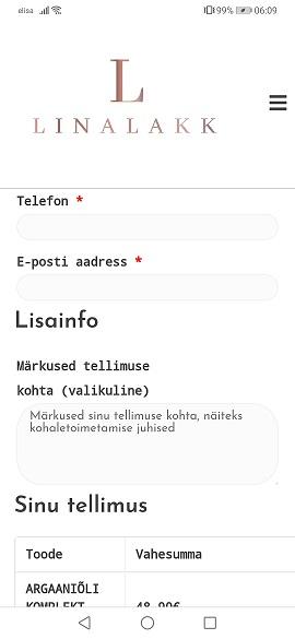
How can i make Logo block smaller for mobile view? It covers most of the screen and its hard for customer to make a order.

You can make the image have a maximum height or width, with some custom CSS code.
maximum height:
@media only screen and (max-width: 768px) {
    img.custom-logo {
        max-height: 100px;
        width: auto;
    }
}
or use maximum width if you prefer:
@media only screen and (max-width: 768px) {
    img.custom-logo {
        max-width: 150px;
    }
}
The custom CSS should be added to ‘Customize’ > ‘Additional CSS’.
Change the max-height or max-width size to your own preference.