- This topic has 5 replies, 2 voices, and was last updated 8 years, 1 month ago by .
Viewing 6 posts - 1 through 6 (of 6 total)
Viewing 6 posts - 1 through 6 (of 6 total)
- The topic ‘Screen size fixes’ is closed to new replies.
Home › Forums › Trusted Pro › Screen size fixes
Tagged: screen sizes, top bar
Hello,
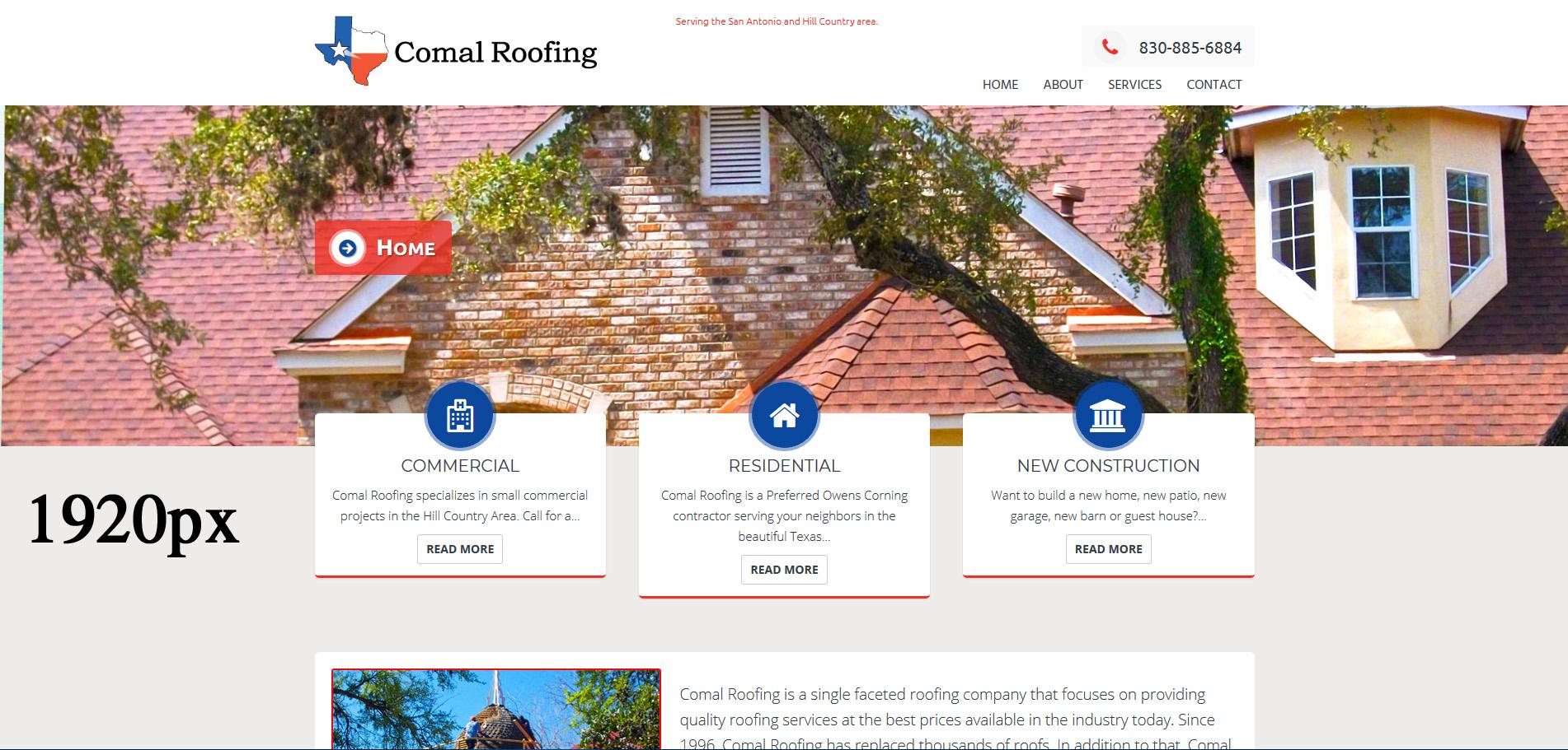
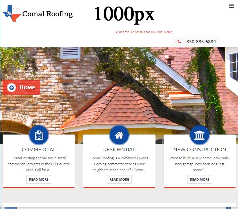
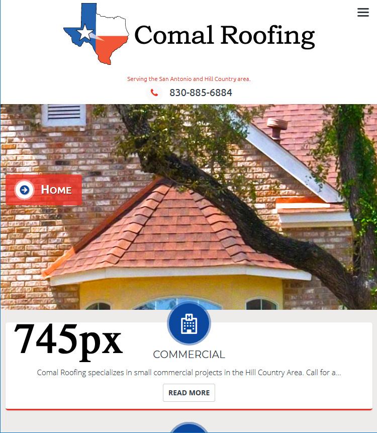
I am having problems on different screen sizes with my top bar. It gets “jacked-up” between 1000px and 745px. Once it is below 745px it is fine and above 1000px it is fine, but the in between looks awful! Please help! Thank you!


Have you added your own CSS to alter the layout of any part of the header area?
The reason I ask is because in the 1920px screenshot the tagline (site description) looks out of alignment.
Is this on a live site that I can take a look at?
Also, in the Theme Options what setting have you selected for the ‘Masthead Navigation Responsive Break-Point’?
Yes I do have additional css rules applied. Do I need to add them here so you can see?
Yes it is live on a testing server at the moment. You can view it here: http://comalroofing.spvisions.com/
Masthead Navigation Responsive Break-Point: 1024px
The additional css that you have added is messing up the header, specifically this part:
@media screen and (min-width: 768px){
    #site-branding {
        width: 30%;
Remove the ‘width: 30%’ and it should be OK.
That did fix it but made the logo really small 🙁 Is there a way to make it bigger without jacking everything else up? Thanks.
The standard width of #site-branding is 20% so if you want to change it to 30% you will need to also change the widths of #site-description and #top-info
At that screen width the standard width of #top-info is 73% with a 7% right margin to leave room for the mobile menu hamburger icon.
(20% + 73% + 7% = 100%)
so to change #site-branding to 30% the #top-info (and #site-description) would need to be changed to 63%
(30% + 63% + 7% = 100%)