- This topic has 6 replies, 2 voices, and was last updated 8 years, 5 months ago by
 planetshay.
-
AuthorPosts
-
October 20, 2017 at 5:35 pm #2370
 planetshayParticipant
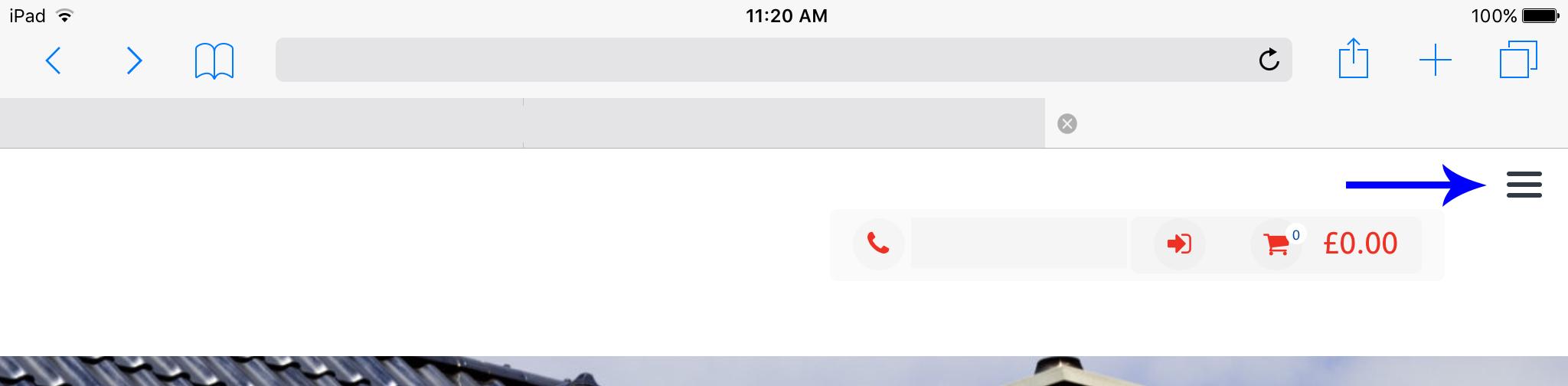
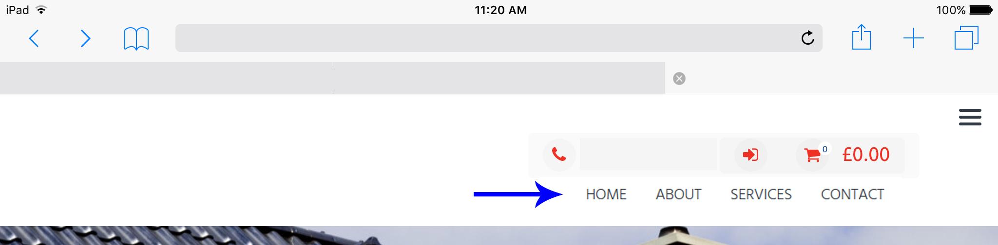
Can you please help make my tablet menu show normally? I only have 4 main menu buttons and there is plenty of room to display them on an iPad or tablet devise.
This is what it shows (landscape view):
This is what I want it to show:
Thanks!
October 20, 2017 at 9:09 pm #2381 YazminKeymaster
It is designed that way as some sites have a lot more than four menu items and we have to strike a balance at what screen width to display the mobile menu.
You can change the width at which the mobile menu is triggered with some custom CSS. Add this in Customize > Appearance > Additional CSS and let us know if this works better for your site.
@media screen and (max-width: 1024px){
    .toggle-nav{
        display: none;
    }
    #primary-menu {
        text-align: left;
        height: auto;
        position: relative;
        right: auto;
        padding-top: 0;
        width: 80%;
    }
    #primary-menu li{
        width: auto;
        float: right;
    }
}

@media screen and (max-width: 768px){
    .toggle-nav{
        display: block;
        position: absolute;
        top: 0;
        right: 0;
        z-index: 1000;
        width: 47px;
        height: 47px;
    }
    #primary-menu{
        background: #fff;
        text-align: left;
        height: 100vh;
        overflow: auto;
        position: fixed;
        right: -250px;
        padding-top: 50px;
        width: 250px;
        z-index: 100;
    }
    #primary-menu li{
        width: 100%;
    }
}
October 30, 2017 at 7:21 pm #2442planetshayParticipantThank you so much for your response. Unfortunately, it did not change any thing 🙁
Any other suggestions?
October 30, 2017 at 8:06 pm #2443YazminKeymasterTested the code on our demo and it worked. Can you let me know the URL of your site please and I’ll take a look and see why it doesn’t work on your site.
October 30, 2017 at 10:04 pm #2448planetshayParticipantYes, here it is: http://wp.mondyglobal.com/
Thank You!
October 31, 2017 at 10:55 am #2463YazminKeymasterThanks. I’ve looked at your site and the code is working correctly.
The mobile menu is now triggered at 768px width instead of the default 1024px.
768px is a good width to distinguish between mobile and tablet but, if you need the standard menu to stay on screen at less width, you can change the 768px value on this line:
@media screen and (max-width: 768px){October 31, 2017 at 3:07 pm #2466planetshayParticipantThank you. I was checking it in Customize area of the Theme, not an actual Tablet and yes it works. Sorry about that and thank you for your help 🙂
-
AuthorPosts
- The topic ‘Tablet Menu’ is closed to new replies.