Home Forums Lorina Pro Close Menu display…

Tagged: ,

Viewing 4 posts - 1 through 4 (of 4 total)
  • Author
    Posts
  • #10597
    Destiny Lauritsen
    Participant

    Hi,

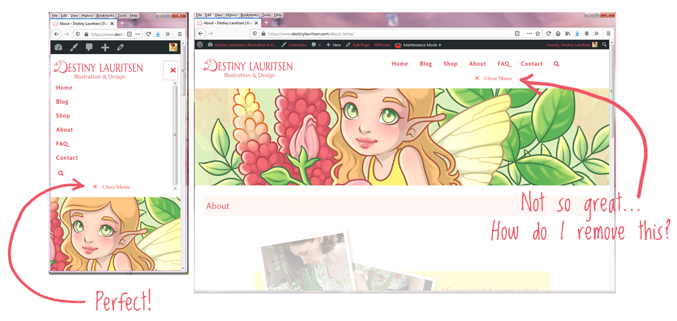
    In the mobile drop-down menu I wanted to make the ‘Close Menu’ text button visible (because it seemed strange to have the large white space under the search button with no visible purpose).  I did figure out how to do that– but it also made the ‘Close Menu’ text visible in desktop mode, which I don’t want.  Can you help fix this?

    Here’s a screenshot of the two:

    And this is the code I used:

    #site-navigation .menu-close {
    color: #ff8787!important;
    display: inline;
    width: 100%;
    padding-top: 5px;
    opacity: 1;
    }

    Thank you for your help– I’m loving this theme! 🙂

    #10611
    Andy
    Keymaster

    It is the display: inline; line that is making it always visible, including on desktop.
    You don’t need to include this line.

    The following CSS code is all you should need to make the close menu visible on smaller screens:

    #site-navigation .menu-close {
        opacity: 1;
    }
    #10612
    Andy
    Keymaster

    Just a bit of additional information, the close menu button is by default only visible when using keyboard navigation for accessibility purposes, to ‘close the loop’ so keyboard users can close the menu without needing to tab backwards to the main ‘X’ close icon at the top.

    If you want to hide it completely and remove the empty space at the bottom of the menu, add this CSS:

    #site-navigation .menu-close {
        display: none !important;
    }
    #10616
    Destiny Lauritsen
    Participant

    Awesome– thank you so much for both options! 🙂

Viewing 4 posts - 1 through 4 (of 4 total)
  • The topic ‘Close Menu display…’ is closed to new replies.