Home › Forums › Trusted Pro › Header Help (mobile, desktop, tablet)
- This topic has 15 replies, 2 voices, and was last updated 8 years, 7 months ago by
 planetshay.
-
AuthorPosts
-
November 10, 2017 at 4:58 pm #2713
 planetshayParticipant
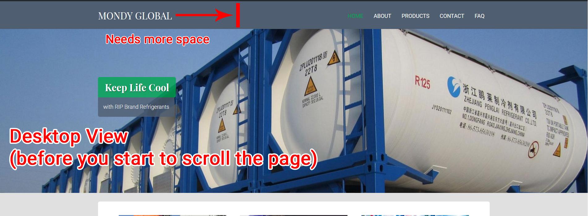
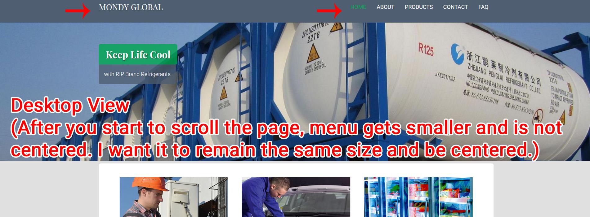
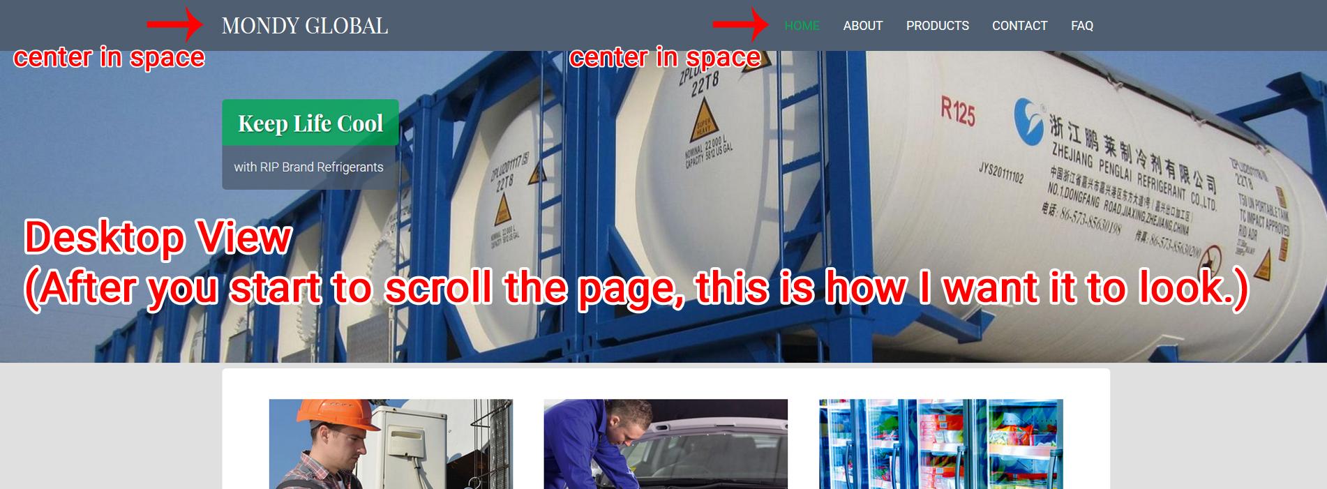
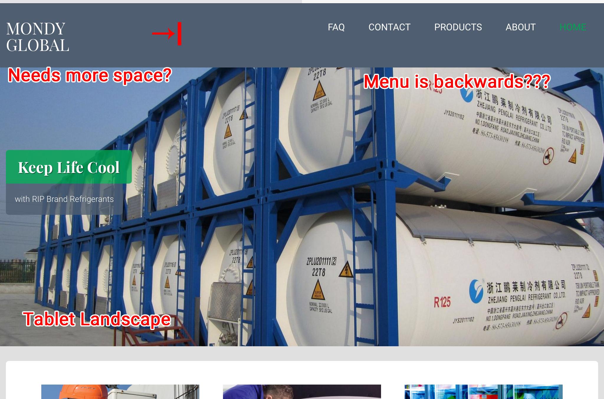
Hello, I am attaching several images on 3 different devices regarding the header/menu items that I need help with. See below:
Desktop Views
Like this:
Tablet Landscape View (this needs centering as well)
Tablet Portrait Views


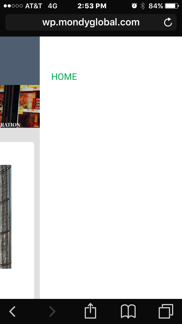
Mobile Portrait Views (is there any way to make the photo “not so big” in phone view?)


Mobile Landscape Views


This is allot I know but as I have mentioned before, I am a graphic artist, not a web developer, so my spacial orientation factor is really high.
Thanks in advance 🙂
November 14, 2017 at 3:09 pm #2737planetshayParticipantHello,
I know you helped me with my child theme problem and I really do appreciate that SO much 🙂 How ever, I am still having problems with the above issues. One of the main things I need help with is setting up more space for the Site Title. I need to put Inc. on the end of the name but when I do is shows up below Mondy Global and looks funny. The spacing the way it is now also puts “Global” under Mondy in Tablet view and that just doesn’t look right? I want to adjust the space between the Title and the menu. Can you please help me with that?
Also, my Menu on Tablet view is still backwards and needs to be fixed (see above photo).
Is there any way to make the header picture in phone view be smaller? It takes up allot of space, even after scrolling.
Thanks for your help 🙂
November 16, 2017 at 10:36 am #2778 AndyKeymaster
Sorry for the delay in replying to you. We missed this thread somehow!
Regarding the mobile menu, it looks like it is not so simple to change the width at which the mobile menu appears instead of the desktop menu, so the CSS I supplied previously won’t work fully as intended as the theme was not designed with this in mind.
Going forward we are looking at adding functionality to a future update that will allow you to select when the mobile/dektop menu appears.
November 16, 2017 at 4:04 pm #2793planetshayParticipant1. So does this mean there is no way to add more space for the site title area itself and less for the main menu area? Changing the css rules for those areas should do it, I just need to know exactly which rules are involved. Could you please give me the names of those and I will try to figure it out, please?
2. Is there no way to fix the menu on tablet view so that it won’t be backwards?
3. Is there no way to change the size of the main header area when on phone view so that the picture isn’t so big?
If you could at least give me the file names for these areas I can try and change them myself. I figure 1 and 2 have to do with css rules, I just need to know the css rule name. And 3 has to do with a php file, but which one and what rule? If you can point me in the right direction I would greatly appreciate it!
November 16, 2017 at 6:11 pm #2795AndyKeymaster1. the site title is 20% on desktop and menu area is 80%. Change them like this:
@media screen and (min-width: 1025px){
    #site-branding{
        width: 20%;
    }
    .site-navigation{
        width: 80%;
    }
}
this assumes not using the modified css from before to make the mobile menu only appear at a narrower width, so in your case you could use this:
@media screen and (min-width: 769px){
    #site-branding{
        width: 20%;
    }
    .site-navigation{
        width: 80%;
    }
}
2. not at the moment no sorry it is quite a major change to get that to work how you want it. Please wait for the next update which will have option to change the break-point for mobile menu.
3. this can be changed by changing the padding at top and bottom of the page title area:
.header-title {
    padding-top: 70px;
    padding-bottom: 70px;
}
the code above will format it on all screen widths, to change it on mobile only use this:
@media screen and (max-width: 768px){
    .header-title {
        padding-top: 70px;
        padding-bottom: 70px;
    }
}
We’re happy to help with minor CSS modifications but if you are going to be changing a lot of the formatting I would very much recommend looking into using browser inspection tools which you could use to find the right elements to modify. See the links below for more information.
November 16, 2017 at 9:23 pm #2797planetshayParticipantI appreciate your help but unfortunately, it did not work. The code just jacked up the spacing of everything 🙁 I will have to talk to my client once I share the site with them next week and see what they say. I may have to go with a different theme in all. I do appreciate your help on everything, however, I can’t seem to get the functionality I am trying to achieve, especially in mobile and tablet views 🙁
I did notice that when in “mobile” version, I cannot see see the menu when you click on it. Both on phone and tablet? How do I fix that?
 November 17, 2017 at 11:14 am #2811AndyKeymaster
For now I would recommend you remove the additional CSS code relating to the navigation menu and site title, and wait for our planned update that will have options to change the break-point for mobile menu that I mentioned previously.
Of course if you are finding the theme is not suitable for your needs, we do offer a 30 day money back policy. If you decide you would like a refund please let me know and I’ll issue it right away.
November 17, 2017 at 4:08 pm #2820planetshayParticipantThank you Andy. I really do and have appreciated all your help 🙂
Do you happen to know when the next update will be?
November 17, 2017 at 4:20 pm #2821planetshayParticipantOh, and how do I get the menu to be viable on mobile and tablet view? It only shows Home (not the other menu buttons). I did delete the code as you mentioned above but the menu on mobile and tablet did not change, it’s still invisible. Am I the only person this is happening to?
November 17, 2017 at 5:59 pm #2824planetshayParticipantI just figured it out. I didn’t realize you had put the css into my child theme style.css (I had the same code in my additional css rules and that’s where I deleted it from earlier). Therefore, it is fixed now. Thanks 🙂 and sorry to bother you with this again!
November 17, 2017 at 6:45 pm #2825AndyKeymasterThanks for letting me know and glad it’s fixed now 🙂
November 28, 2017 at 8:04 pm #2942planetshayParticipantHello,
I just met with my client this morning and they do want to add more space to the header title (where Mondy Global is) so I just want to to see if the update I just installed had the functionality update that will allow you to select when the mobile/desktop menu appears (you mentioned above) and the navigation menu and site title update that will have options to change the break-point for mobile menu you mentioned above. If so, how and where do I make changes to it?
Thanks.
November 29, 2017 at 9:27 am #2952AndyKeymasterGo into Customize > Theme Options and there is now the new Masthead Navigation Responsive Break-Point setting where you can select the screen width for the point at which the desktop menu becomes the mobile menu.
November 29, 2017 at 2:57 pm #2957planetshayParticipantThank you, that helped with the menu, YAY!
However, I still need more space for the Title (site identity text). If you look at my very first post on this subject (see the photos)…..the Desktop view and the tablet landscape view is still messed up! I need more space for the Company name on both Desktop (so I can put Inc on the end of Mondy Global) and Tablet landscape view (so Mondy is not stacked on top of Global, it needs to be beside it)!!!!!!
PLEASE! My client needs the Inc on the end, but does not want the text smaller in order to do so. Please help!!!
November 29, 2017 at 4:43 pm #2961AndyKeymasterIf I am understanding correctly what you want to achieve, please try this:
@media screen and (min-width: 769px){ #site-branding { width: 40%; } #site-description.eighty { width: 60%; } .site-navigation { width: 60%; } } @media screen and (max-width: 768px){ #site-branding { padding-top: 20px; } } .toggle-nav { top: 18px; } -
AuthorPosts
- The topic ‘Header Help (mobile, desktop, tablet)’ is closed to new replies.