Home › Forums › Trusted Pro › Header Image size
- This topic has 10 replies, 2 voices, and was last updated 8 years, 7 months ago by
 planetshay.
-
AuthorPosts
-
November 13, 2017 at 8:02 pm #2731
 planetshayParticipant
Can you please tell me what the Header image size is on both the Front Page and the other pages? I have tried to add an image and it keeps getting cut off. Thanks!
November 14, 2017 at 9:22 am #2732 AndyKeymaster
The header background image does not have a definitive fixed size.
It is a background image that fills the header area.
The size – and the width/height ratio – of the header area will vary depending on the size of the screen, so the background image will cover that area without stretching the image. This does mean that sometimes either the top/bottom or the sides may be “cut off”.
If it didn’t “cut off”, the background image would either have to strech to cover the height or the width or to avoid stretching it would be cut short and you would have empty space at the top/bottom or the sides.
I hope this helps to explain how the header background image works.
December 5, 2017 at 8:13 pm #3031planetshayParticipantHi Andy!
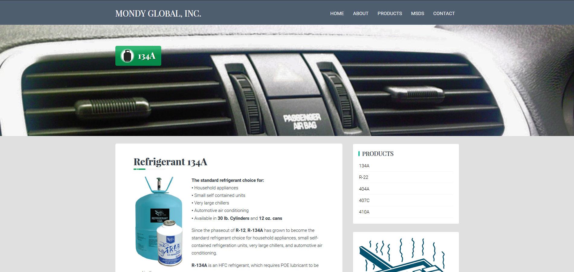
Is thee a way to make the header image bigger (height) on sub-pages? With the images I have been given it cuts them off and it is hard to tell what they are (so my client says). Here is an example page: http://wp.mondyglobal.com/products/134a/
Thanks!
December 5, 2017 at 8:17 pm #3032planetshayParticipantOh, and I only need it bigger in desktop view. It looks fine on tablet and phone views.
December 6, 2017 at 10:32 am #3036AndyKeymasterYou could do something like this:
@media screen and (min-width: 1025px){
    .main-header{
        height: 450px;
    }
}
obviously change 1025px and 450px to values suitable for your needs.
December 6, 2017 at 6:15 pm #3039planetshayParticipantHi Andy!
Thank you for your help. Yes, that did help, however, it made the title on the page “un-centered” in the header area. Please see below:
Is there a way to fix this to make it centered in the space as it was before? (see below)
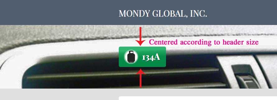
Thanks 🙂
December 7, 2017 at 10:15 am #3040AndyKeymasterTry it with increased top padding on the title area
@media screen and (min-width: 1025px){
    .main-header{
        height: 450px;
    }
    .header-title{
        padding-top: 160px;
    }
}
December 7, 2017 at 3:36 pm #3048planetshayParticipantPerfect! Thank you SO much Andy 🙂
December 7, 2017 at 5:21 pm #3049planetshayParticipantHi Again! I am so sorry about asking so many questions…as the above did work for my sub-pages, it has done something really strange to my home page. The content area is now on top of my slider, which for the most part I do not mind, I think it looks cool.
However, if I resize my browser window, the main content area on the Home page “jumps” quit a ways below the header area for a short time, then goes back to the normal position (not above the Header area).
Now, I am using a 23-24′ monitor, so when I start minimizing the browser window, this is when it happens. Is there any way to keep it where it is or at least the way it was before (similar to all the sub-pages)?
Here are pictures of the progress:


I hope this is making sense. If not, please go to the website and check out the Home page, then, resize your browser window slowly.
As I said above, I don’t mind the window being on top of the slider (second photo) but I would like it be be that way all the time if that is possible, no matter what size screen it is on. If that is not possible, I just need it to go back to the way it was before in the first photo.
Thank you!
December 7, 2017 at 6:49 pm #3050AndyKeymasterCan you try this please
.home .main-header{
    height: unset;
}
this *should* stop the header height being applied to the homepage, while still applied to other pages.
December 7, 2017 at 8:36 pm #3051planetshayParticipantYes sir. That fixed it. You are awesome!!!!!!!!!!! Thank you 🙂
-
AuthorPosts
- The topic ‘Header Image size’ is closed to new replies.