- This topic has 6 replies, 3 voices, and was last updated 8 years, 4 months ago by
 Andy.
Andy.
-
AuthorPosts
-
October 31, 2017 at 4:02 pm #2469
 planetshayParticipant
Hello!
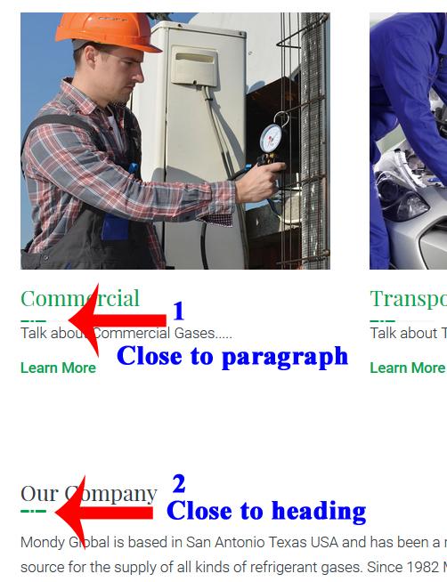
Can you please help me fix the lines under the Headings to match across all Headings? For instance see below:

I would rather they be more like #2 or evenly spaced.
Also, is there a way to change the image to something else like:

Thanks!
October 31, 2017 at 7:31 pm #2489 YazminKeymaster
to change all headings from H1 to H6 so that the underline are all the same size, add this in Customize > Additional CSS (change the width and height values to whatever size you want):
.entry-content h1:before,
.entry-content h2:before,
.entry-content h3:before,
.entry-content h4:before,
.entry-content h5:before,
.entry-content h6:before{
width: 30px;
height: 4px;
}
to use your own image use this css instead (change image-url to the URL of your image):
.entry-content h1:before,
.entry-content h2:before,
.entry-content h3:before,
.entry-content h4:before,
.entry-content h5:before,
.entry-content h6:before{
background-image: url("image-url");
}
October 31, 2017 at 9:10 pm #2491 planetshayParticipant
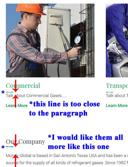
Thank you so much for your help. However, I am referring to the “spacing” between the line and the paragraph/Headings, like so:
Heading
—- (although I don’t want this much space, I just want the line not so close to the paragraph)
Paragraph

Thanks!
November 1, 2017 at 11:31 am #2492 YazminKeymaster
Ahh I see. It is the Beaver Builder plugin that is overriding the theme’s styling.
Try this in Additional CSS:
body h1.fl-callout-title,
body h2.fl-callout-title,
body h3.fl-callout-title,
body h4.fl-callout-title,
body h5.fl-callout-title,
body h6.fl-callout-title{
margin-bottom: 20px;
}
November 1, 2017 at 6:34 pm #2499 planetshayParticipant
Oh Thank You so much!!! That helped on all of the headings as you can see below with the exception of the one at the bottom? I am not familiar with Beaver Builder, I just thought it was installed when I installed the theme? Is there a way to fix this issue inside the plugin itself? I am not a pro at building websites, my main job is graphic design so I am pretty picky when it comes to things being evenly spaced and symmetrical (I drive myself crazy sometimes because it bothers me so bad :-/).
 November 1, 2017 at 6:46 pm #2500
 planetshayParticipant
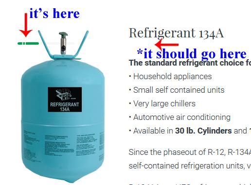
I am so sorry to bother you again but I was checking all the pages on the site and noticed that this line is not even under the heading? I tried moving the picture before and after the heading but it made no difference. Is this a Beaver Builder issue too? Should I deactivate it?
 November 2, 2017 at 8:39 am #2507
 AndyKeymaster
No, the Beaver Builder plugin is nothing to do with us. It is a completely separate plugin and none of our themes will ever install third-party plugins without permission.
As it would be impossible to develop the theme to take account of all the potentially millions of combinations of theme/plugin/site configurations, in the theme settings there is the option to turn off the headings underline image.
‘Appearance’ > ‘Customize’ > ‘Theme Options’ > [] Disable Headings Underline
-
AuthorPosts
- The topic ‘Headings underline image’ is closed to new replies.
