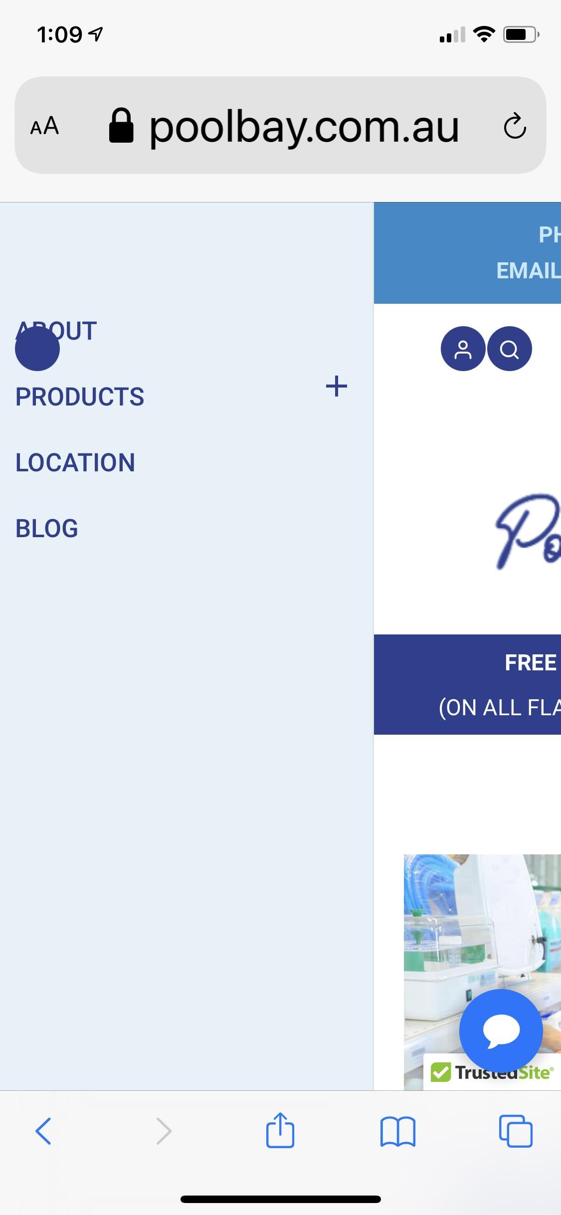
[Resolved] Mobile Menu issues Home › Forums › Retail Pro › Mobile Menu issues Tagged: mobile menu This topic has 2 replies, 2 voices, and was last updated 5 years, 7 months ago by Andy. Viewing 3 posts - 1 through 3 (of 3 total) Author Posts December 10, 2020 at 2:09 am #12918 SamParticipant Hi, My mobile menu does not look right. There are a few issues I would like to know how to fix if possible. – I would like the burger menu to be on the right rather than the left. – When the burger menu is open, the close menu button obscures the menu text. – When the burger icon is open the X (which I assume is there) to close the menu is the same colour as the circle meaning it cannot be seen. Thank you for your help. December 10, 2020 at 10:24 am #12919 SamParticipant December 10, 2020 at 10:47 am #12923 AndyKeymaster Please use the following snippets of custom CSS, added at ‘Customize’ > ‘Additional CSS’. Move mobile menu (burger icon) to the right: @media (max-width: 1024px) { .toggle-nav { left: auto; right: 10px; } #page.is-visible #primary-menu, #masthead.is-visible #primary-menu { left: auto; right: 0; } #page.is-visible { left: 0; } #masthead #site-top-right { padding-right: 40px; } #masthead #site-top-left { padding-left: 0; } } Fix close menu position: .toggle-nav.is-visible { top: 15px !important; } Fix close menu icon color: .toggle-nav.is-visible .menu-icon { color: #fff; } Author Posts Viewing 3 posts - 1 through 3 (of 3 total) The topic ‘Mobile Menu issues’ is closed to new replies.
 .
.
 .
.