- This topic has 6 replies, 2 voices, and was last updated 5 years, 5 months ago by .
Viewing 7 posts - 1 through 7 (of 7 total)
Viewing 7 posts - 1 through 7 (of 7 total)
- The topic ‘Mobile product display’ is closed to new replies.
Tagged: Mobile product display
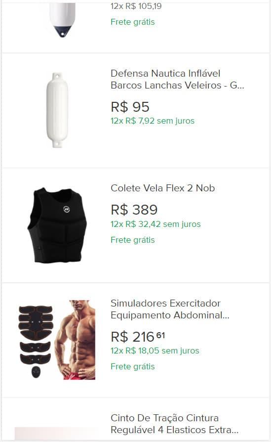
I tried some solutions already presented here on the forum and was not successful, I would like to present two products per line when the site is accessed by cell phone.
Add this CSS to ‘Customize’ > ‘Additional CSS’:
@media (max-width:480px) {
    .woocommerce ul.products[class*="columns-"] li.product,
    .woocommerce-page ul.products[class*="columns-"] li.product {
        width: 48% !important;
        float: left !important;
    }
}Thank you.
We were able to display only the image without the title, and separate the two blocks, it was very glued together.
On second thought, I believe that showing this way is better.
It is very difficult to display it like this, so when accessed by cell phone, I saw that the home continued showing the products in full screen.
Yes, the homepage still shows Unique Blocks as it is a page I set up with Elementor, I believe that is why it did not work for the homepage. However, if you go to the store or some categories, two blocks appear. Thank you so let’s keep it up then. As always very attentive and accurate in solving problems.
With the deactivation of the sliding effects, I have not yet been able to deactivate the sliding effect in the upper block (widget) that contains contact information. I’m trying to disable that sliding effect when the page is scrolled.
Please ask one question per topic. This helps others who may be looking for the same/similar answers.
If you have a new question, please start a new topic, as your question about a sliding effect of contact information is not related to this topic. Thanks.