- This topic has 6 replies, 2 voices, and was last updated 5 years, 2 months ago by .
Viewing 7 posts - 1 through 7 (of 7 total)
Viewing 7 posts - 1 through 7 (of 7 total)
- The topic ‘Secondary Menu?’ is closed to new replies.
Tagged: Feature Modification
Hello, I could really use a secondary menu built into the theme. I’ve tried finding blocks that might work but I just need a clean horizontal menu at the top of the page that is separate from the primary menu. thanks in advance.
One option would be to add a ‘Navigation Menu’ widget to the ‘Top Bar’ widget area.
This would display a secondary menu in the top bar above the logo/site title/main menu area.
If you want the top bar menu to display below the logo/main menu area, add this custom CSS to ‘Customize’ > ‘Additional CSS’:
#masthead {
    display: flex;
    flex-direction: column-reverse;
}Thanks for the quick response.
Yes, I tried to add a navigation menu to the top bar widget but I have no control how it looks and works and it looked horrible on mobile. A built-in secondary menu would be most helpful.
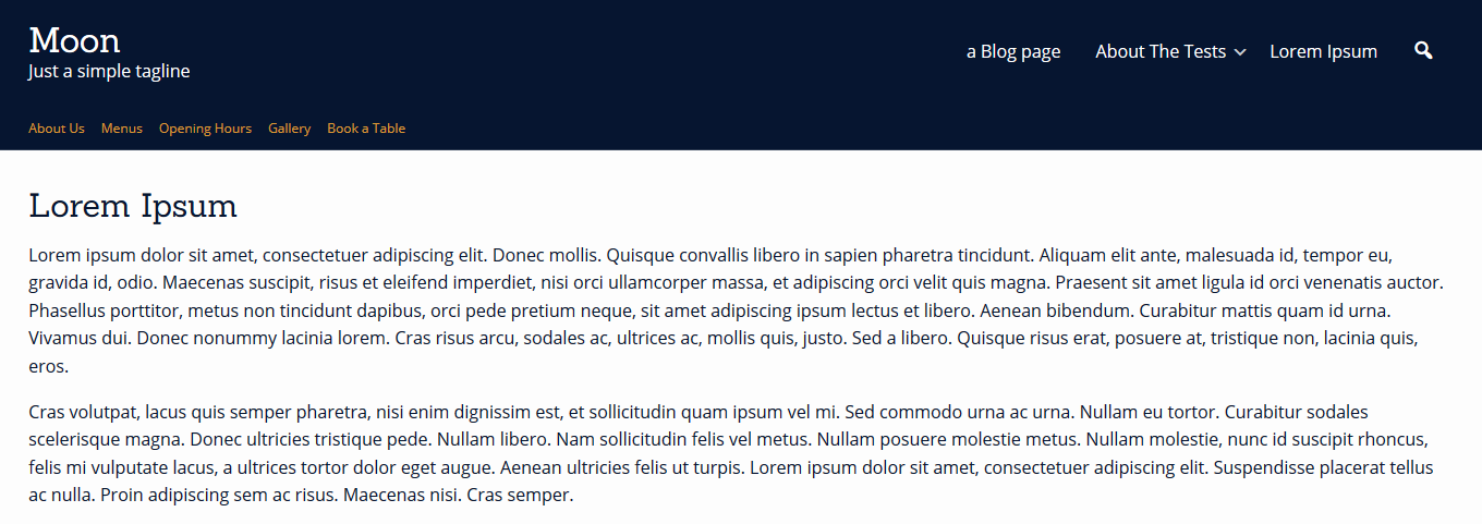
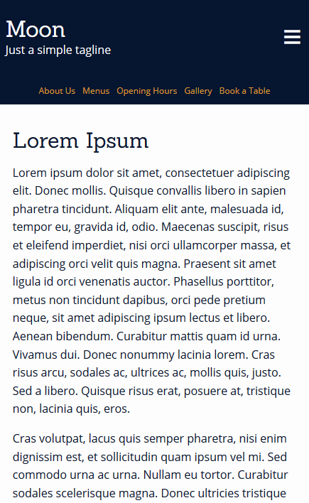
This is what it looks like when I tried the top bar menu.
It works across mobile and larger devices, and the menu color/spacing/text size etc can all be customized with some custom CSS styling.
Laptop view

Mobile view

To add a secondary menu into the theme, you will need to create a child theme, copy the code from the parent theme’s (Ibsen Pro) header.php file to a file with the same name in the child theme, and then add additional code for a secondary menu in the child theme’s header.php file.
Thank you for the info.
Is there a way to center the Navigation Menu Widget in the top bar? My problem is my customer really wants a horizonal menu just for his categories but not get stacked if too many categories or go to hamburger menu on mobile.
This ‘Additional CSS’ will center the top bar widget:
#top-bar .widget {
    display: block;
    width: 100%;
    text-align: center !important;
}