- This topic has 14 replies, 2 voices, and was last updated 6 years, 2 months ago by
Frederik Leemans.
-
AuthorPosts
-
April 11, 2020 at 10:58 pm #10174
Frederik Leemans
ParticipantDear Support,
On a mobile device, all of the widgets in the ‘shop sidebar’ drop to the bottom. Is it possible to have a specific widget ‘on top’ of the products page, rather than at the bottom?
Thanks,
Frederik
April 12, 2020 at 9:43 am #10180 AndyKeymaster
Have you tried the “Shop Filters” widget area?
This is designed specifically to display horizontally above the products on the products page (shop page, product categories etc.).
April 12, 2020 at 10:15 am #10181ParticipantI have; and it almost fits the bill: the only problem I have is that there’s an extra line of text added (‘Product filters’) and that it requires clicking a drop-down. Is there any way to avoid that?
<div id=”ConnectiveDocSignExtentionInstalled” data-extension-version=”1.0.4″></div>
<div id=”ConnectiveDocSignExtentionInstalled” data-extension-version=”1.0.4″></div>April 12, 2020 at 10:33 am #10182AndyKeymasterAdd this to Additional CSS:
.shop-filter-wrap .shop-filter-toggle {
    display: none;
}

.shop-filter-wrap #shop-filters {
    display: table;
}
This will hide the dropdown toggle, and make the widget area visible at all times.
April 12, 2020 at 11:27 am #10183ParticipantThank you! Exactly what I was looking for!
<div id=”ConnectiveDocSignExtentionInstalled” data-extension-version=”1.0.4″></div>
<div id=”ConnectiveDocSignExtentionInstalled” data-extension-version=”1.0.4″></div>April 13, 2020 at 10:35 am #10185ParticipantAny tips on how to make the search box & dropdown box the same size/font/etc?
<div id=”ConnectiveDocSignExtentionInstalled” data-extension-version=”1.0.4″></div>
<div id=”ConnectiveDocSignExtentionInstalled” data-extension-version=”1.0.4″></div>April 13, 2020 at 11:36 am #10186AndyKeymasterThis should make the WooCommerce dropdown same size as search box:
#shop-filters {
    font-size: 100%;
}

.select2-container .select2-selection--single {
    height: auto;
    margin-top: 2px;
}

.select2-container--default .select2-selection--single {
    border-radius: 3px;
    border-width: 0;
}

.select2-container--default .select2-selection--single .select2-selection__rendered {
    padding: .718em 1em;
}

.select2-container--default .select2-selection--single .select2-selection__arrow {
    top: 10px;
}
April 13, 2020 at 11:45 am #10187AndyKeymasterAlso, this will make the search box and button look better:
#shop-filters form {
    max-width: 100%;
}

#shop-filters button {
    padding: .718em 1em;
    line-height: 1.4;
    height: auto;
}
April 13, 2020 at 2:02 pm #10188ParticipantThanks for your help!
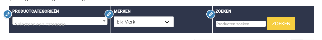
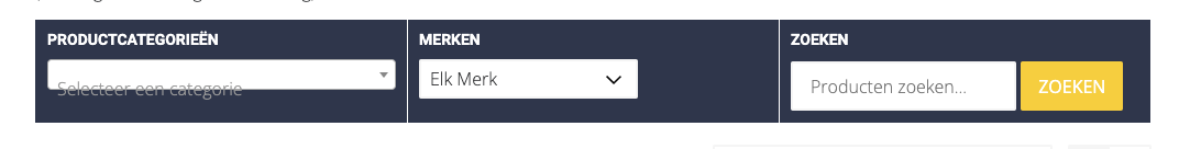
I did apply the second css snippet, but the first one doesn’t seem to improve things:
The ‘Select a category’ text is positioned lower than the actual dropdown itself, both on Chrome & Safari.
The second css does improve the look of the search, but the rendering is of the search box differs between Chrome & Safari:
On Safari, it is smaller than the search button. On Chrome, search box and button are the same size, but they don’t match the Category dropdown in size, or vertical alignement.
Cheers, F
<div id=”ConnectiveDocSignExtentionInstalled” data-extension-version=”1.0.4″></div>
<div id=”ConnectiveDocSignExtentionInstalled” data-extension-version=”1.0.4″></div>April 14, 2020 at 10:19 am #10194AndyKeymasterWould you be able to add the first bit of CSS again, so I can take a look and work out a solution?
April 15, 2020 at 9:23 am #10200ParticipantWe could if we can agree on a date/time when you’d be able to take a look? It’s really quite ugly, so I don’t want to keep it online for too long – and I haven’t got a staging site for now.
Alternatively, here’s a few screenshots of what this CSS produces:
On Safari:
On Chrome:
You can see the page live @ https://www.ruitersportjokari.be/shop
Let me know if the above seem sufficient, or if you’d still rather set a time slot.
Thanks,
Frederik
<div id=”ConnectiveDocSignExtentionInstalled” data-extension-version=”1.0.4″></div>
<div id=”ConnectiveDocSignExtentionInstalled” data-extension-version=”1.0.4″></div>April 15, 2020 at 11:54 am #10203AndyKeymasterHi Frederik,
Thanks for the screenshots, that really helped.
Could you please remove the previous CSS I gave you, and replace with this:
.shop-filter-wrap .shop-filter-toggle {
    display: none;
}

.shop-filter-wrap #shop-filters {
    display: table;
}

#shop-filters {
    font-size: 100%;
}

.select2-container .select2-selection--single {
    height: auto !important;
    margin-top: 2px !important;
}

.select2-container--default .select2-selection--single {
    border-radius: 2px !important;
    border-width: 0 !important;
}

.select2-container--default .select2-selection--single .select2-selection__rendered {
    padding: .618em 1em !important;
    line-height: 1.4 !important;
}

.select2-container--default .select2-selection--single .select2-selection__arrow {
    top: 10px !important;
}

#shop-filters form {
    max-width: 100%;
}

#shop-filters input[type="search"] {
    border-width: 0;
    -moz-appearance: none;
    -webkit-appearance: none;
}

#shop-filters button {
    padding: .618em 1em;
    line-height: 1.4;
    height: auto;
    -moz-appearance: none;
    -webkit-appearance: none;
}
This amended code should work now. If not, please let me know.
April 15, 2020 at 7:16 pm #10207ParticipantHi Andy,
Much better, thank you!
Only strange artefact left is that in Safari, the search button is below the search field, whereas on other browsers, it’s located to the right. Very strange 🙂
Cheers, Frederik
<div id=”ConnectiveDocSignExtentionInstalled” data-extension-version=”1.0.4″></div>
<div id=”ConnectiveDocSignExtentionInstalled” data-extension-version=”1.0.4″></div>April 15, 2020 at 7:32 pm #10208AndyKeymasterThe search button to the right or below depends on how much available space there is for the text input and button to be able to display inline. When I view your site the button is below the text input on Firefox and Chrome.
You can give the text input a maximum width so there is enough available space to display the button to the right.
e.g.
#shop-filters input[type="search"] {
    max-width: 190px;
}
April 15, 2020 at 8:56 pm #10209ParticipantWorks like a charm!
Thanks,
Frederik
<div id=”ConnectiveDocSignExtentionInstalled” data-extension-version=”1.0.4″></div>
<div id=”ConnectiveDocSignExtentionInstalled” data-extension-version=”1.0.4″></div> -
AuthorPosts
- The topic ‘Widget locations desktop vs mobile’ is closed to new replies.