Forum Replies Created
-
AuthorPosts
-
Frederik Leemans
ParticipantWorks like a charm!
Thanks,
Frederik
<div id=”ConnectiveDocSignExtentionInstalled” data-extension-version=”1.0.4″></div>
<div id=”ConnectiveDocSignExtentionInstalled” data-extension-version=”1.0.4″></div>ParticipantHi Andy,
Much better, thank you!
Only strange artefact left is that in Safari, the search button is below the search field, whereas on other browsers, it’s located to the right. Very strange 🙂
Cheers, Frederik
<div id=”ConnectiveDocSignExtentionInstalled” data-extension-version=”1.0.4″></div>
<div id=”ConnectiveDocSignExtentionInstalled” data-extension-version=”1.0.4″></div>ParticipantWe could if we can agree on a date/time when you’d be able to take a look? It’s really quite ugly, so I don’t want to keep it online for too long – and I haven’t got a staging site for now.
Alternatively, here’s a few screenshots of what this CSS produces:
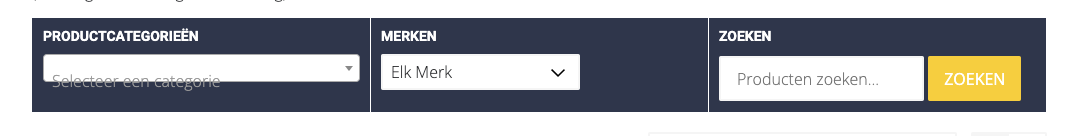
On Safari:
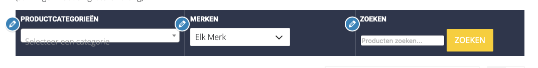
On Chrome:
You can see the page live @ https://www.ruitersportjokari.be/shop
Let me know if the above seem sufficient, or if you’d still rather set a time slot.
Thanks,
Frederik
<div id=”ConnectiveDocSignExtentionInstalled” data-extension-version=”1.0.4″></div>
<div id=”ConnectiveDocSignExtentionInstalled” data-extension-version=”1.0.4″></div>ParticipantThanks for your help!
I did apply the second css snippet, but the first one doesn’t seem to improve things:
The ‘Select a category’ text is positioned lower than the actual dropdown itself, both on Chrome & Safari.
The second css does improve the look of the search, but the rendering is of the search box differs between Chrome & Safari:
On Safari, it is smaller than the search button. On Chrome, search box and button are the same size, but they don’t match the Category dropdown in size, or vertical alignement.
Cheers, F
<div id=”ConnectiveDocSignExtentionInstalled” data-extension-version=”1.0.4″></div>
<div id=”ConnectiveDocSignExtentionInstalled” data-extension-version=”1.0.4″></div>ParticipantAny tips on how to make the search box & dropdown box the same size/font/etc?
<div id=”ConnectiveDocSignExtentionInstalled” data-extension-version=”1.0.4″></div>
<div id=”ConnectiveDocSignExtentionInstalled” data-extension-version=”1.0.4″></div>ParticipantThank you! Exactly what I was looking for!
<div id=”ConnectiveDocSignExtentionInstalled” data-extension-version=”1.0.4″></div>
<div id=”ConnectiveDocSignExtentionInstalled” data-extension-version=”1.0.4″></div>ParticipantI have; and it almost fits the bill: the only problem I have is that there’s an extra line of text added (‘Product filters’) and that it requires clicking a drop-down. Is there any way to avoid that?
<div id=”ConnectiveDocSignExtentionInstalled” data-extension-version=”1.0.4″></div>
<div id=”ConnectiveDocSignExtentionInstalled” data-extension-version=”1.0.4″></div>ParticipantGreat, that addresses my problem.
Thanks!
<div id=”ConnectiveDocSignExtentionInstalled” data-extension-version=”1.0.4″></div>
<div id=”ConnectiveDocSignExtentionInstalled” data-extension-version=”1.0.4″></div>ParticipantYep, that seems to fix the problem.
Thanks!
Frederik
ParticipantHi Andy,
Doesn’t seem to resolve the problem…
I do have another bit of extra CSS in there, but I don’t think it would interfere:
.entry-header.with-image.full:before,
.archive-header.with-image.full:before {
background: transparent;
}Picked that up from this site to keep the original header image colors.
Thanks,
Frederik
ParticipantSure. Still ‘under construction’, but this is it:
Thanks,
Frederik
ParticipantYup. Works like a charm. Thanks, Andy!
-
AuthorPosts