- This topic has 9 replies, 2 voices, and was last updated 7 years, 8 months ago by
 Andy.
Andy.
-
AuthorPosts
-
July 30, 2018 at 4:02 pm #5329
Howardthebrit
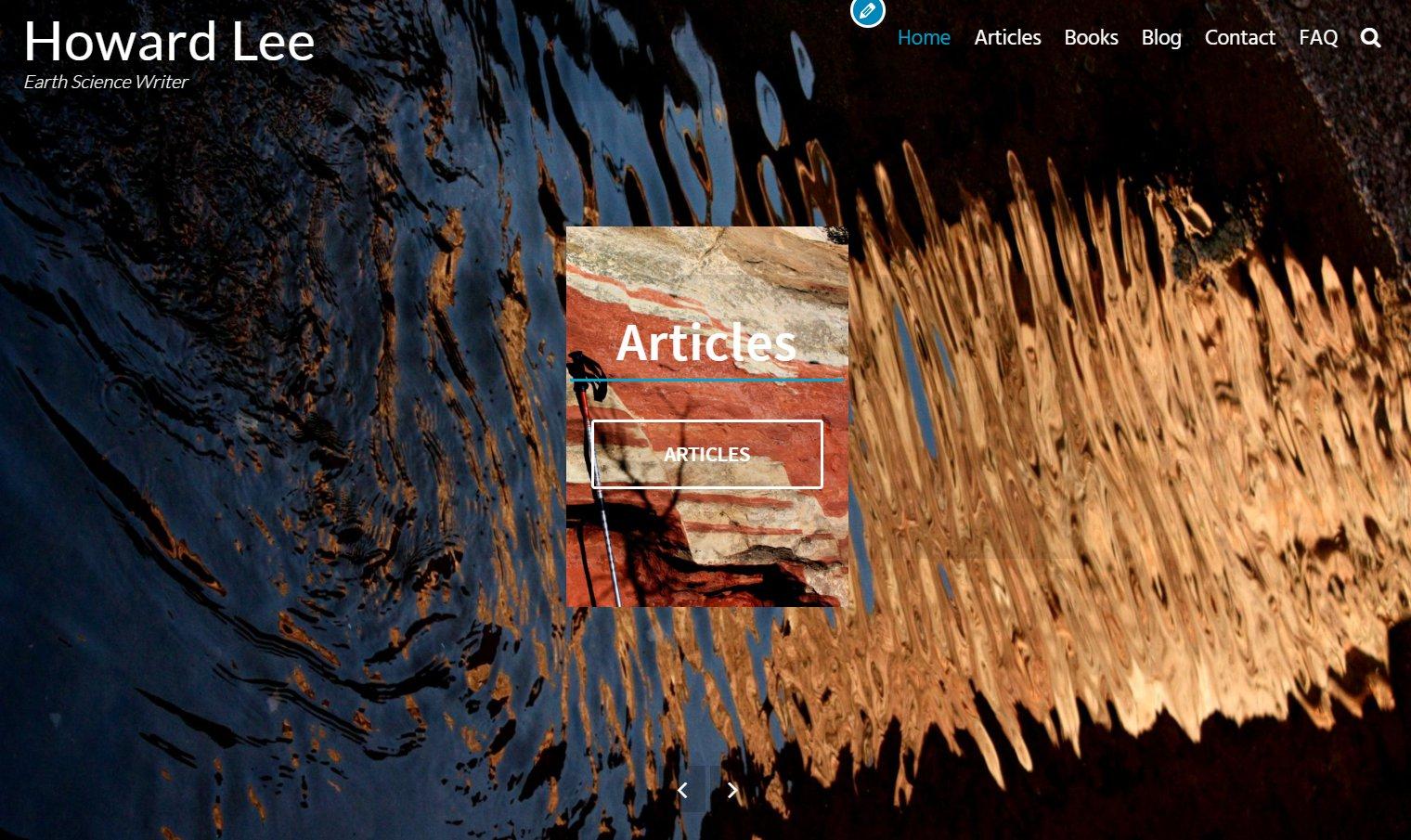
ParticipantHi – I have the home page slider with 2 slides, and using the featured image of the target pages. The trouble is that the featured image covers the entire background, when I’d like it to appear as a small image, with the background image still visible behind. Is there a way to set a % or size for the display of the featured image?
Alternatively I could use the “featured services” option for the home page, but I want to use images, not icons.
I’d appreciate any suggestions,
Thanks
July 30, 2018 at 7:19 pm #5331 AndyKeymaster
Hi,
You could change the size and position of the image with some Additional CSS such the snippet below, but there won’t be a background image to show behind because the featured image is the background image
.slide {
    background-size: 50%;
    background-repeat: no-repeat;
    background-position: center center;
}
If you want to add your own images in place of the icons for the featured services, that option is available in the pro version of Exoplanet.
July 30, 2018 at 7:26 pm #5332 AndyKeymaster
Update: just thinking about this, you could set a background image for the whole of the slider area to show behind the slides, with this Additional CSS:
#home-slider-section {
    background-image: url("url-of-your-image");
}
change ‘url-of-your-image’ to the actual image URL which you can get by clicking on your image in the dashboard media library to open up the image editor.
July 30, 2018 at 8:17 pm #5333Howardthebrit
ParticipantThanks…. is there a tip on where the css file is so I can try to edit it?
Also – good to know about the option to use images vs icons in the pro version – any restrictions on the size/format? I’m looking to use a full color image about 300px wide.
July 30, 2018 at 8:47 pm #5334 AndyKeymaster
Sorry I should have said to add custom CSS in ‘Appearance’ > ‘Customize’ > ‘Additional CSS’
It is not recommended to edit the theme’s css files directly as your changes would be undone when the theme is updated.
The featured services images accept the same image formats as the WordPress media library (jpg, png, gif etc) and the size can be adjusted from any value from 20px to 200px in the customizer, although with some custom CSS it would be possible to set the image size at 300px.
The border size and style can also be adjusted in the customizer, see the pro demo 2 and pro demo 3 for different image sizes and border styles.
July 30, 2018 at 8:57 pm #5335Howardthebrit
ParticipantThanks again.
It looks like the featured services icons/images in pro is the way to go, but I really liked the clean look of the slider. I’d have accepted being able to click on the slider heading, but only the buttons are clickable.
Feature request (have the heading clickable in the slider, without having to have a button)? Or better still have images instead of buttons….
July 30, 2018 at 10:35 pm #5336Howardthebrit
ParticipantI used your first css snippet:
.slide { background-size: 50%; background-repeat: no-repeat; background-position: center center; }
and it works REALLY well!
The slider image floats in front of the background, with the background still visible behind it, just as I wanted. BUT 2 issues: the placement of the button and heading over the image is visually not great, and while 30% is fine on a computer screen it isn’t on a cell phone (ridiculously tiny), so I’m going to try the pro option/icons/images next.
Thanks for your help Andy – that css snippet is really 90% of the way to what I wanted.
 July 30, 2018 at 10:45 pm #5341
 AndyKeymaster
For mobile screens you can use different styling by wrapping the CSS code with a media rule like so:
@media screen and (max-width: 768px) {
    .slide {
        background-size: 80%;
    }
}
This in addition to to previous code would make the background size 50% on screens above 768px wide, and 80% on screens below 768px wide.
Thanks for the suggestions but unfortunately that would be beyond the rules of what themes are allowed to do if they are to be included in the wordpress.org theme repository. The rules say that would be classed as content creation which is the domain of plugins.
July 31, 2018 at 6:41 am #5342Howardthebrit
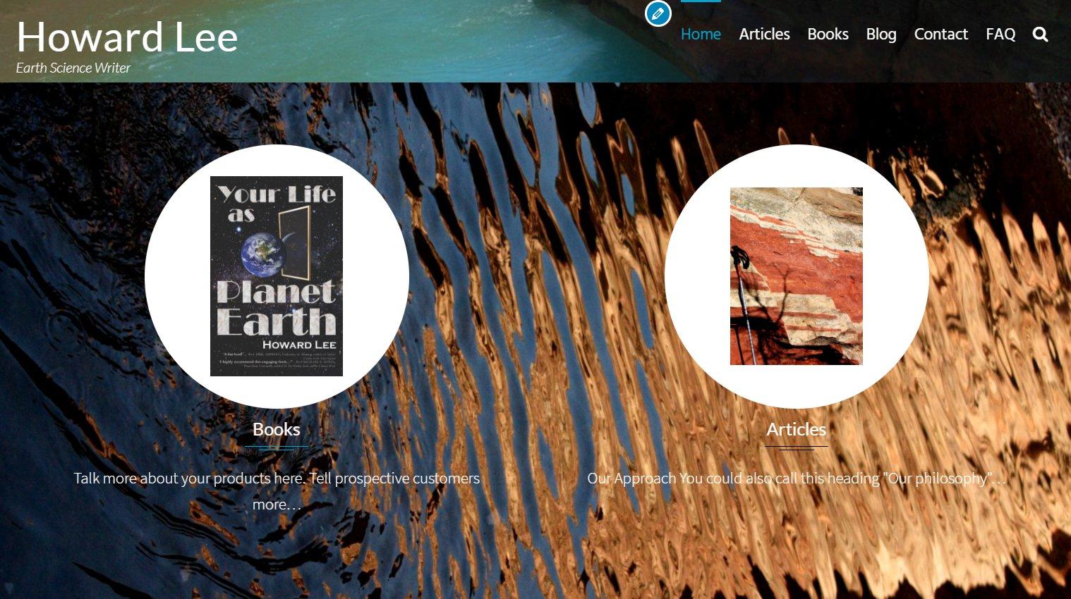
ParticipantSO… I upgraded to pro and after a minor coronary until i found the “import from exoplanet” option, I switched to the featured services, with images replacing the icons. BUT now the images are surrounded by annoying white circles that I can’t seem to make go away… any ideas?
 July 31, 2018 at 7:00 am #5345
 AndyKeymaster
The featured services icon/image is circular by default with a white background. Change this with the following added to ‘Additional CSS’
.featured-post .featured-icon { background: transparent; border-radius: 0; width: 300px; height: auto; } .featured-post img { max-width: 100%; } -
AuthorPosts
- The topic ‘Setting the size of the featured image in the home page slider’ is closed to new replies.
