Forum Replies Created
-
AuthorPosts
-
December 29, 2018 at 3:01 pm in reply to: Removing header image (and page title) on product archive pages. #6418
Adri Oosterwijk
ParticipantMmm…. I see that I’ve given you wrong info. I’m totally confused. Forget the part about the missing (or changed) div. Really don’t know what is happening.
December 29, 2018 at 2:56 pm in reply to: Removing header image (and page title) on product archive pages. #6417Adri Oosterwijk
ParticipantSpending the last couple of hours to find a solution (following your advice) I noticed in the WooCommerce docs a partial solution.
I wrapped the call for the header in an if statement:
‘ if (!is_woocommerce()){
if ($trusted_custom_header) {
trusted_custom_header_title($trusted_this_id);
} else {
trusted_header_title();
}
}’The header is disappeared but also is the <div class=”container clearfix”> changed to <div id=”content” class=”site-content clearfix”>
The result is that the page becomes full with (no container of 1160px and the content is shifted to the upper left corner, partially hidden by the (so to say) header bar.
I could not find a way to fix this myself so, again, I need your help. (Sorry)
December 29, 2018 at 11:56 am in reply to: Removing header image (and page title) on product archive pages. #6415Adri Oosterwijk
ParticipantYes…. and more
It basically boils down to all archives which are displaying products in all languages.
- Product archives (shop page) -> archive-product.php
- Product search results -> archive-product.php
- Product categories -> taxonomy-product_cat.php
- Product tags -> taxonomy-product_tag.php
- Are there more? I need it on those too. 🙂
Note that it has to be in all languages (existing and new to add).
As always, thanks for your help.
December 29, 2018 at 11:37 am in reply to: Removing header image (and page title) on product archive pages. #6413Adri Oosterwijk
ParticipantHi Andy, thanks for your reply.
The Categories I can manage this way because there are only 31 of them in 2 languages (that makes 62). That is a one time operation.
The tags is a different story. At this moment (with approx. 1.000 products) I have already 2.280 distinct tags in English and 2.280 tags in Dutch and more to come when more products and/or languages are added.
As this is very time-consuming to edit all categories and tags manually I am hoping for a better solution.
A function for in my functions.php perhaps? That could (should) solve my multilingual issue also.
What I meant was that a translated page exists ‘on its own’ like you said. The strange thing however is when I try to edit the translated page (which is possible) with the normal page editor, I’m not able to do so because I’m presented with a different interface as shown in the screenshots.
To ask WPML for help is useless because the Trusted Pro theme is not on their compatibility list (yet). They simply don’t know what to do.
Again, I do hope you are able to help me out with a code solution that covers it all.
I do not mention to extend the theme with this option as I know that there are not many customers who want this. As I have a very big amount of products +1000 right now and thousands more to come I need to have as much screen real estate as possible.
Please help…..
December 29, 2018 at 9:38 am in reply to: Removing header image (and page title) on product archive pages. #6405Adri Oosterwijk
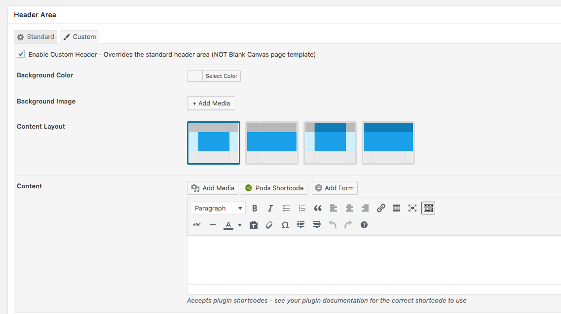
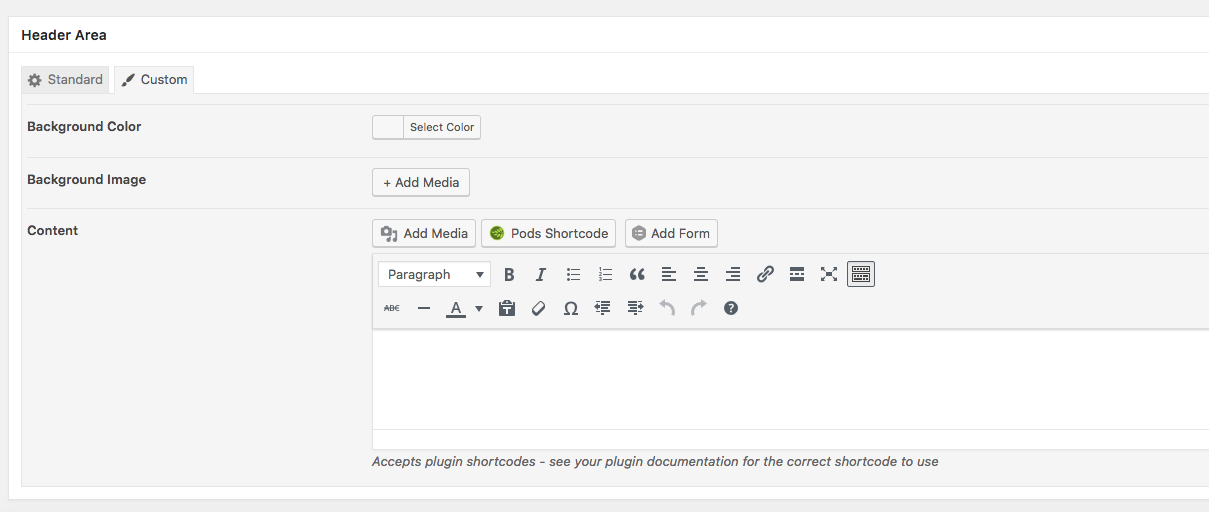
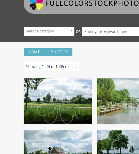
ParticipantI noticed that the above-described method not functions when I try to do the same on a (WPML) translated page (product archive). The editor for the header area differs in the English and the Dutch page. I do hope and trust you have a solution.
See screenshots.

Adri Oosterwijk
ParticipantAs alway…. works great. Thanks.
Again, I leave this thread open for a while to to follow up on the ctr with this adjustment enabled.
Best wishes,
Adri
Adri Oosterwijk
ParticipantHi Andy,
Thank you for your reply. I did try that but gives me a somewhat messed up result. See screenshot below.
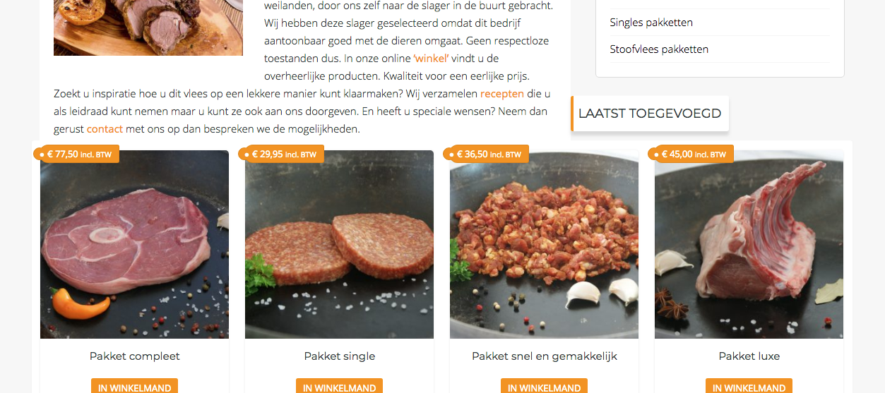
The products are overlapping the page content a bit and the heading “Laatst toegevoegd” is displayed beneath the sidebar. I tried to solve it with css as I suspect the solution is in that corner but I did not manage to get it right. Any help with it is much appreciated.
Thanks in advance.
Adri
Adri Oosterwijk
ParticipantHi Andy,
I promised to keep you posted on this matter and below are our findings.
I changed the position of the ‘Add to Cart’ button’ for all devices. It is displayed underneath the product title. It is less beautiful in my opinion but it does work better.
The improvement of the CTR is impressive. Where the bounce rate was around 85% before that percentage has dropped to 44% when the visitor is at the shop page. It looks like (at least here in the Netherlands) that the visitor is afraid to tab the thumbnail when a button ‘Add to Cart’ appears on hover.
Maybe they think that they have bought the product when they tab the thumbnail, I don’t know.Still, i think there is room to improve it more. The homepage still has a high bounce rate. Especially on mobile devices. I think it is because there is a lot of scrolling involved before the actual page content appears on the mobile screens. First there is the header image, second the featured tabs, then the latest added products (8 of them) and then finally the content of the page.
My question:
I’m wondering is it possible to move the products (in our case the latest added) underneath the page content? And if so, how do I do that?And lastly, I have created a Dutch translation (.mo and .po). It were mostly customizer strings to be translated and a few strings which are appearing on the site. (No comments, 1 Comment, x Comments) for example). Are you interested in those files to incorporate them in a next update?
Just let me know and I will send them over.
Best wishes,
adri
-
This reply was modified 7 years, 9 months ago by
Adri Oosterwijk.
Adri Oosterwijk
ParticipantHi Andy,
It seems to be working. We are gonna try this for a while an I let you know. Maybe there are other users having the same issue…….
When the CTR is better we have to decide what we want but, like said, we are trying this for a while.
Thanks again.
Adri Oosterwijk
ParticipantI have temporarily disabled the add to cart button on mobile (with you last snippet) and it seems to be working correctly now.
Like I mentioned I try to keep the design as clean as possible so the option to put the add to cart button below the product title via the customizer is not my preference.
When there is no other option, is it possible to do that for mobile devices only?
I mean on desktops visible when hovering the thumbnail and on mobile devices placed beneath the product title? I do want to give the visitor the option to add it to the cart right away although I do believe they want to see what the get before they buy. Maybe customers who are reordering….
I think we are not totally done yet but we are on the right track, I think.
Thanks for you help Andy.
Adri Oosterwijk
ParticipantAddition: it happens also on my iPad and as it seems only on the product archive pages.
On Post archive pages it works like it should.
Adri Oosterwijk
ParticipantHi Andy,
You did it again. A superb solution.
Thank you very much.
Adri
Adri Oosterwijk
ParticipantHi Andy,
Thank you for your reply. I looked at the demo and it is not quite what I aim for. One of the reasons I chose for the Trusted Pro theme was the clean design of the product archive pages with the “add to cart button” displayed when hovering the thumbnail.
I overlooked the (IMHO) limitation on the mobile pages.
So, I would be very, very happy when there will be an option for a “VIEW” button on top of the thumb with a link to the single product page. Only on mobile devices as far as I’m concerned. And always visible on those mobile devices. I am convinced that it will improve the user experience on mobile devices a lot.
The add to cart button can be left out because no one is seeing it on mobile devices (ok, they see it for a short time when tabbing a product photo, but because they are navigating to te single product page is that not very beneficial to them).
I do hope you will see the benefits as well to add it in the next release, and if so I do hope that this next release is coming out very, very soon.
Adri Oosterwijk
ParticipantHi Andy, thank you for your reply and explanation.
I will read up about it with the links provided.
This issue is resolved now.
Have a great day!
Adri
Adri Oosterwijk
ParticipantHi Andy,
And again….. it works perfect.
I’m happy with the solution but I’m not able to figure out what was wrong in the code. The solution now is: don’t fire the function when the user is admin and has the dashboard displayed. But what is causing the trouble in the first place? Any idea? Just curious….
Adri
-
AuthorPosts
