Forum Replies Created
-
AuthorPosts
-
 planetshayParticipant
OMG Andy, AWESOME!!!!!! I am SO happy!!!!!!!!! That finally did it! THANK YOU SOOOOOOOOOOOOOOOOOOOOOOOOOOOOOOOOOOOO much! You are the bomb 🙂
 planetshayParticipant
Thank you, that helped with the menu, YAY!
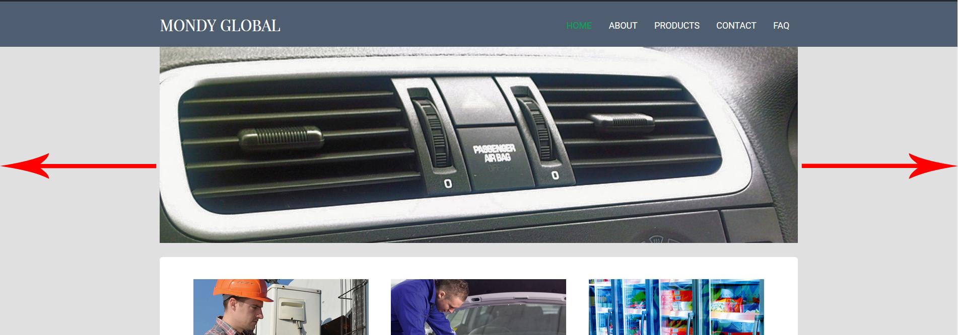
However, I still need more space for the Title (site identity text). If you look at my very first post on this subject (see the photos)…..the Desktop view and the tablet landscape view is still messed up! I need more space for the Company name on both Desktop (so I can put Inc on the end of Mondy Global) and Tablet landscape view (so Mondy is not stacked on top of Global, it needs to be beside it)!!!!!!
PLEASE! My client needs the Inc on the end, but does not want the text smaller in order to do so. Please help!!!
 planetshayParticipant
Hello,
I just met with my client this morning and they do want to add more space to the header title (where Mondy Global is) so I just want to to see if the update I just installed had the functionality update that will allow you to select when the mobile/desktop menu appears (you mentioned above) and the navigation menu and site title update that will have options to change the break-point for mobile menu you mentioned above. If so, how and where do I make changes to it?
Thanks.
 planetshayParticipant
I just figured it out. I didn’t realize you had put the css into my child theme style.css (I had the same code in my additional css rules and that’s where I deleted it from earlier). Therefore, it is fixed now. Thanks 🙂 and sorry to bother you with this again!
 planetshayParticipant
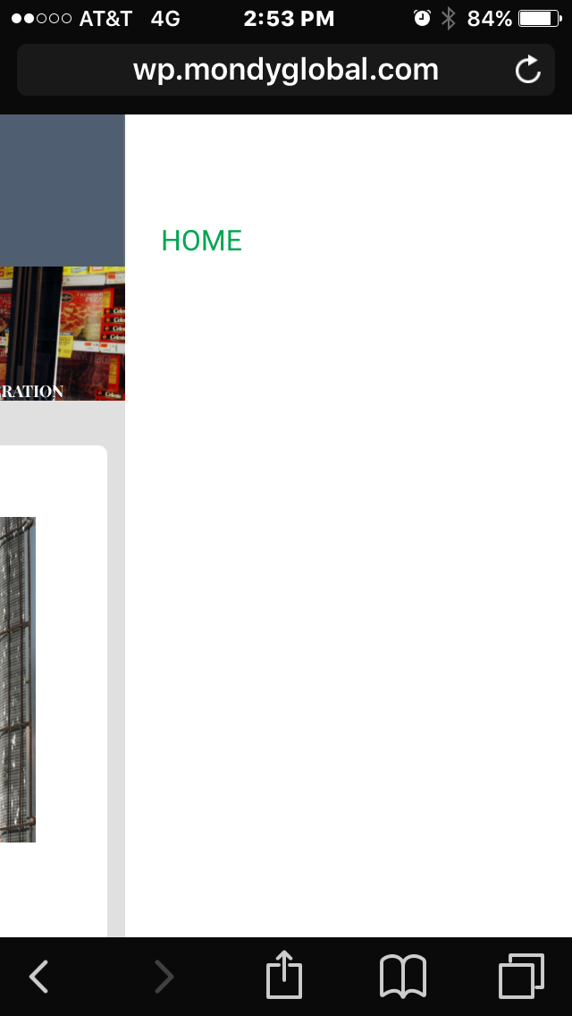
Oh, and how do I get the menu to be viable on mobile and tablet view? It only shows Home (not the other menu buttons). I did delete the code as you mentioned above but the menu on mobile and tablet did not change, it’s still invisible. Am I the only person this is happening to?
 planetshayParticipant
Thank you Andy. I really do and have appreciated all your help 🙂
Do you happen to know when the next update will be?
 planetshayParticipant
I appreciate your help but unfortunately, it did not work. The code just jacked up the spacing of everything 🙁 I will have to talk to my client once I share the site with them next week and see what they say. I may have to go with a different theme in all. I do appreciate your help on everything, however, I can’t seem to get the functionality I am trying to achieve, especially in mobile and tablet views 🙁
I did notice that when in “mobile” version, I cannot see see the menu when you click on it. Both on phone and tablet? How do I fix that?

 planetshayParticipant
1. So does this mean there is no way to add more space for the site title area itself and less for the main menu area? Changing the css rules for those areas should do it, I just need to know exactly which rules are involved. Could you please give me the names of those and I will try to figure it out, please?
2. Is there no way to fix the menu on tablet view so that it won’t be backwards?
3. Is there no way to change the size of the main header area when on phone view so that the picture isn’t so big?
If you could at least give me the file names for these areas I can try and change them myself. I figure 1 and 2 have to do with css rules, I just need to know the css rule name. And 3 has to do with a php file, but which one and what rule? If you can point me in the right direction I would greatly appreciate it!
 planetshayParticipant
I fixed it. I used a different slider and it worked. With the exception of the way the page scrolls now…The content doesn’t cover the header once you start scrolling for some reason???
 planetshayParticipant
Thank you for the update. However, I have a question,,,when I add a slider to the Home page under Custom > Content, it wraps the slider in <p></p> which means it does not stretch all the way across the site (like all the other header images)? How can I add a slider without constraining the width to the content of the rest of the page?

 planetshayParticipant
Hello,
I know you helped me with my child theme problem and I really do appreciate that SO much 🙂 How ever, I am still having problems with the above issues. One of the main things I need help with is setting up more space for the Site Title. I need to put Inc. on the end of the name but when I do is shows up below Mondy Global and looks funny. The spacing the way it is now also puts “Global” under Mondy in Tablet view and that just doesn’t look right? I want to adjust the space between the Title and the menu. Can you please help me with that?
Also, my Menu on Tablet view is still backwards and needs to be fixed (see above photo).
Is there any way to make the header picture in phone view be smaller? It takes up allot of space, even after scrolling.
Thanks for your help 🙂
 planetshayParticipant
I deactivated the plugins and the option to add a header image still wasn’t there?
 planetshayParticipant
I’m not even sure I was using it. I download stuff allot trying to get things to look the way I want them to or to get access to editing more easily. I am graphic artist, not really a web developer so when I want things to look right, as I said, I start adding plugins to see if they help, but I guess I forget to deactivate them when they don’t.
Thanks again for your help 🙂
 planetshayParticipant
Kirki Toolkit
 planetshayParticipant
Oh, by the way, here is my site if you need to look at it: wp.mondyglobal.com
-
AuthorPosts
