Forum Replies Created
-
AuthorPosts
-
 AndyKeymaster
To put the button below the product title on mobile devices
@media screen and (max-width: 768px) { .woocommerce ul.products li.product .button.add_to_cart_button, .woocommerce ul.products li.product .button, .woocommerce a.added_to_cart { position: relative; right: auto; top: auto; margin: 0 15px 15px 15px; filter: Alpha(Opacity=1); opacity: 1; visibility: visible; } } AndyKeymaster
Or if you don’t want to try that, try completely removing the add to cart button from the equation, and see if it improves the user experience when tapping the product thumbnail.
@media screen and (max-width: 768px) { .woocommerce ul.products li.product .button.add_to_cart_button, .woocommerce ul.products li.product .button, .woocommerce ul.products li.product:hover .button.add_to_cart_button, .woocommerce ul.products li.product:hover .button { display: none; } } AndyKeymaster
When I try it, it only takes 1 tap on either the thumbnail or product title to take me to the single product page.
Have you considered testing it with the add to cart button in the other position below the product title to see if it improves your CTR/sales?
 AndyKeymaster
I have looked at your page in chrome, edge, IE, firefox and safari browsers and the menu and top right button areas are hidden exactly as they should be.
The CSS will apply to all browsers. It might be worth emptying your browser cache and refreshing the page just be to sure you are not seeing cached page.
June 4, 2018 at 10:41 am in reply to: Image resizing: fit to grid without hard crop (Exo / Woo) #4899 AndyKeymaster
To make all the products the same height, you could use CSS styling to set a fixed height.
Write something like this into ‘Customize’ > ‘Additional CSS’:
/*overall height including image, title and price*/
.woocommerce ul.products li.product,
.woocommerce-page ul.products li.product {
    height: 500px;
}

/*height of the image area*/
.woo-thumb-wrap {
    height: 300px;
}
Change the height values to suit your site.
June 3, 2018 at 10:02 am in reply to: Image resizing: fit to grid without hard crop (Exo / Woo) #4887 AndyKeymaster
Hi Silvano
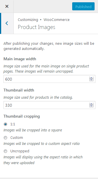
We have removed the image sizes from the latest version of Exoplanet as WooCommerce now has better product image sizing options.
If you update to version 1.7.3 of Exoplanet, you will now see the WooCommerce settings under Appearance > Customize > WooCommerce > Product Images (see screenshot below with the thumbnail size and cropping options)

 AndyKeymaster
It should be possible with CSS. Add the following in Additional CSS
@media screen and (max-width: 768px) {

    ul.products li.product {
        padding-bottom: 10px;
    }

    ul.products li.product .woocommerce-loop-product__title {
        position: relative;
        margin-bottom: 40px !important;
    }

    ul.products li.product .woocommerce-loop-product__title:after {
        position: absolute;
        background: orange !important;
        color: #fff;
        content: "VIEW";
        top: auto;
        bottom: -10px;
        left: 15px;
        height: auto;
        padding: 5px;
        text-align: center;
    }

}
This will put a “VIEW” button directly below the product name, on devices with a browser width below 768px.
 AndyKeymaster
Hi Adri
There is the option to show the add to cart button below the product image & name, and always visible without the need to hover.
— Appearance > Customize > Shop Options > Add To Cart ButtonThis can be seen on the Trusted Pro demo.
 AndyKeymaster
Yes, you can hide the main menu and the top right button on a specific page with a snippet of ‘Additional CSS’ added in the customizer.
e.g. if the page ID is 29, the CSS would be this:
.page-id-29 #top-info,
.page-id-29 .site-navigation {
    display: none;
}
You can find the relevant page ID from the ‘post=29’ part of the URL in your browser address bar when editing the page e.g.
...wp-admin/post.php?post=29&action=edit AndyKeymaster
Sorry about that, there was an error which is now fixed in the latest version of Jorvik.
Please update to version 1.0.2. It should be available to update in your WP dashboard. If not, please wait a few minutes as it can sometimes take up to an hour for updates to made available in the site dashboard.
 AndyKeymaster
Glad to see it is fixed. Thank you for confirming this and letting us know.
 AndyKeymaster
It looks like you are using a plugin called ‘WordPress Download Manager’ and this plugin is overriding the CSS styling of our theme’s icons.
To test this and make sure that it is this plugin causing the issue, could you please temporarily deactivate the WordPress Download Manager plugin and check to see if the icons are displaying correctly again.
 AndyKeymaster
Hi, did you originally upload your product images with a different theme active at the time?
 AndyKeymaster
Hi, the background is designed to be this way to allow for users who may want to use a transparent (or semi-transparent) background color for the top part of the header allowing the background image to show through.
 AndyKeymaster
Hi, the header image is designed to be used with a background image that does not contain text and the image fills the header area horizontally and vertically without stretching the image, so either the top/bottom or the sides may be cut off depending on the screen size and screen width/height ratio.
You could try using an image that is proportionally higher than your current image or with more spacing above the text (with the text further from the top of the image) but if the text is running very wide you will still have the issue of the sides being cut off when viewing on narrow devices such as on mobile.
Have you considered changing your homepage page title from “Home” to your slogan?
-
AuthorPosts
