Forum Replies Created
-
AuthorPosts
-
 AndyKeymaster
Short answer… the ‘pre_get_posts’ filter affects all post queries including the dashboard.
I should have noticed this in my original code, sorry about that.If you’re interested in a more thorough answer, check these links:
 AndyKeymaster
Hi Adri
Could you please try changing this line:
add_filter( 'pre_get_posts', 'trusted_custom_search_filter' );to this:
if ( !is_admin() ) { add_filter( 'pre_get_posts', 'trusted_custom_search_filter' ); } AndyKeymaster
Done some more looking at your site, and I think it may be related to the pop-up box that you have the count down timer asking for an email sign-up.
I cannot seem to close the pop-up on mobile, so I let the timer run down and then refreshed the page and the problem with the mobile menu went away, so while I cannot be 100% sure that it is the pop-up that is causing the problem, that would be the first thing I would look at.
 AndyKeymaster
Hi, it is the same when I view your site on an Android phone.
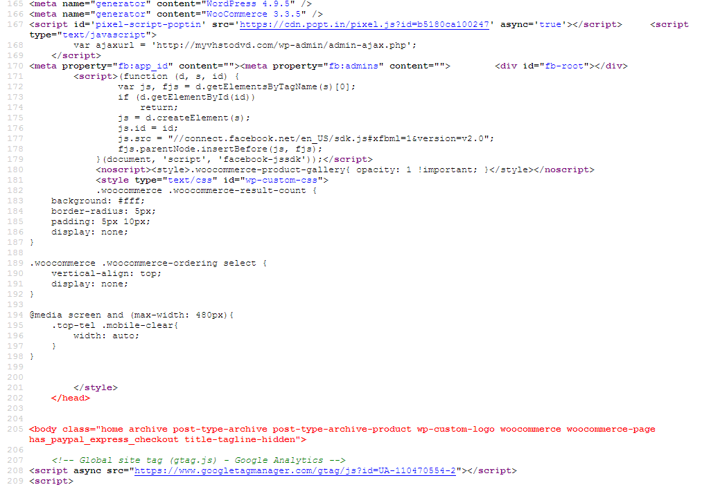
Looking at the source code of your site, there are some HTML markup errors which I suspect is caused by a third-party plugin being poorly coded or incorrectly set up.
See the red code in the screenshots below.To narrow down the issue and rule in/out a plugin problem, I would recommend that you temporarily disable all active plugins (except WooCommerce) and see if the problem goes away.
If the issue disappears after disabling plugins, then re-activate your plugins on-by-one, checking each time to see if the problem re-appears. This will tell you which plugin (if any) is causing the problem.


 AndyKeymaster
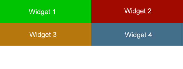
In the Top Bar you can add an image of any size.
One thing to note is that the widgets are automatically formatted to be 50% of the full width on large screens, so if your image is wider than 50% of the full width it will be shrunk to fit so that it does not overflow.
 May 14, 2018 at 8:51 am in reply to: Does the pro version easily import from the free version? #4664
 AndyKeymaster
Hi, your post/page content etc will not disappear or need to be rebuilt when you switch themes. No theme should ever do that and certainly none of our themes will ever do so.
Are you referring instead to the theme customizations?
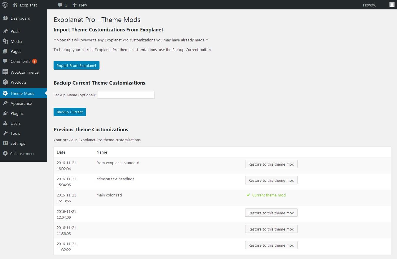
If so, Exoplanet Pro comes with a handy import facility so you can import the theme customizations from Exoplanet into Exoplanet Pro with just the click of one button. See the screenshot below.
 AndyKeymaster
“The CSS option would leave my product seemingly disproportioned on the left?”
No, the first part:
.single-download #primary {
    width: 100%;
}
will make the main content area full-width (#primary is the content area and #secondary is the sidebar area)
“Also, I do still need the sidebar for my articles. The only place I know where to add CSS would change it for the whole site, as far as I am aware.”
Add the CSS in ‘Appearance’ > ‘Customize’ > ‘Additional CSS’.
Yes it’s true it is site-wide but the.single-downloadpart targets only the digital product pages, so the CSS will not take effect on any other pages or posts/articles. AndyKeymaster
The EDD products adds a body class of ‘single-download’ to the page HTML, so you could hide the sidebar on your digital products with this Additional CSS in the customizer:
.single-download #primary {
    width: 100%;
}

.single-download #secondary {
    display: none;
}
Please note this will hide the sidebar from view, and it will still exist in the HTML markup of your product pages but it will be hidden from view.
If you want to remove the sidebar completely from the product pages, it could be done with a plugin such as Widget Options to set the sidebar widgets to not be displayed on posts that are of the ‘download’ post_type.
 AndyKeymaster
The logo at 830px wide is far too big to fit in the logo area.
As you are not using the Site Description/Tagline, you could make the logo area use the tagline area in addition to the standard logo area by adding this Additional CSS:
@media screen and (min-width: 1025px){ #site-branding{ width: 50%; } #site-description{ display: none; } } AndyKeymaster
The images you are using for the featured services are not equal width/height. The first image is 5184 x 3456 pixels!
To fill the circular area, each image’s height and width should be the same. e.g. 160 x 160 pixels.Alternatively, you could add a line of CSS code to force the images to fill the height of the circle –
height: 100%– but they would be stretched vertically and may not look right.
In ‘Additional CSS’:.featured-post .featured-icon img { width: 100%; margin-top: 0; height: 100%; }Sorry, you asked how to change the text color, not the telephone link. Use this instead:
#cta-section a .cta-tel, #cta-section a:hover .cta-tel { color: #9d0200; } AndyKeymaster
* Resize the company logo
The logo can be any size you want. The theme recommends 220×70 but you can use a different size and you do not need to crop the image to 220×70 if you do not wish to do so.* Show an image inside the featured services circles (I need the image to cover the whole circle, not just part of the circle)
Add the following to ‘Additional CSS’ in the customizer:.featured-post .featured-icon img { width: 100%; margin-top: 0; }* Change the colour of the text of the call-to-action panel
Again in ‘Additional CSS’ (change #fff to your preferred color):#cta-section { color: #fff; } AndyKeymaster
In header.php file you will see reference to the trusted_header_title() function on line 114. This function is located in /functions/extras.php starting at line 546 and it is this that contains the output of the page title.
The header background image is output by dynamic CSS in the trusted_dynamic_style() function also in /functions/extras.php. The part that specifically deals with the header image can be found at line 144
$css[] = '.main-header{background-image: '.'url( '.$page_header_bg.' )}'; AndyKeymaster
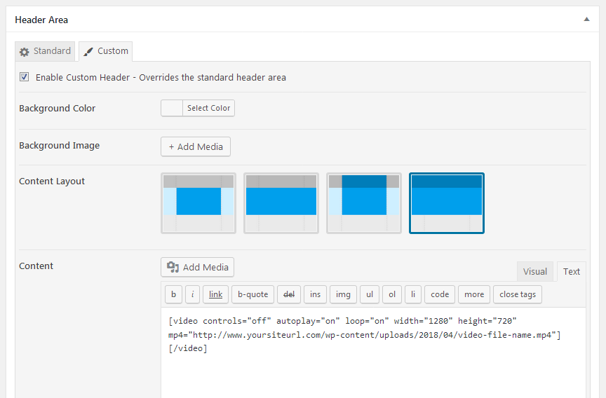
We’re planning on implementing video headers in a future update but for now it can be done with the following instructions.
Go to the page editor for the page you have set as your homepage, select ‘Header Area’ > ‘Custom’ > ‘Enable Custom Header’.
Select your preferred ‘Content Layout’.
In ‘Content’ select the ‘Text’ tab, click ‘Add Media’ button to upload a video or select a video from your media library.
Please note: when selecting the video in the media library, make sure that in the ‘ATTACHMENT DISPLAY SETTINGS’ you select the ‘Embed Media Player’ option.This will give you a video shortcode something like this:
[video width="1280" height="720" mp4="http://www.yoursiteurl.com/wp-content/uploads/2018/04/video-file-name.mp4"][/video]Now add these parameters to the video shortcode:
controls="off" autoplay="on" loop="on"For example:
[video controls="off" autoplay="on" loop="on" width="1280" height="720" mp4="http://www.yoursiteurl.com/wp-content/uploads/2018/04/video-file-name.mp4"][/video]
Save the page, then go into the Customizer and add the following to Additional CSS:
.main-header.custom .wp-video,
.custom-header .wp-video {
width: 100% !important;
}

.main-header.custom .wp-video .mejs-container.mejs-video,
.custom-header .wp-video .mejs-container.mejs-video {
width: 100% !important;
height: 0 !important;
padding-bottom: 56.25%;
}

.main-header.custom .wp-video .mejs-container.mejs-video .wp-video-shortcode,
.custom-header .wp-video .mejs-container.mejs-video .wp-video-shortcode {
width: 100% !important;
}
The padding-bottom: 56.25% part is important and needs to reflect the aspect ratio of your video and will ensure the video is displayed in the correct aspect ratio whatever the screen size.
In the example above the video is 16:9 (1280 x 720) so to work out the correct % value for the padding-bottom use the formula (100/16) x 9 e.g. (100/1280) x 720 = 56.25If the video does not display to fill the header in the customizer view and it doesn’t look quite right, it should be OK on the live site.
 AndyKeymaster
Do you mean in the page content? Which image are you looking to replace?
 AndyKeymaster
The standard padding at the top and bottom of the Call-to-Action Section is 50px.
Change this by adding this CSS code in ‘Appearance’ > ‘Customize’ > ‘Additional CSS’
(change 50px to whatever value(s) you like)#cta-section { padding-top: 50px; padding-bottom: 50px; } -
AuthorPosts
