Forum Replies Created
-
AuthorPosts
-
 AndyKeymaster
Try this in Additional CSS:
.main-header{
    height: 450px;
}
.header-title{
    padding-top: 160px;
}
.home .main-header{
    height: unset;
}
.home .header-title{
    padding-top: unset;
}
You may want to change the 450px height & the 160px top padding, but that should be a reasonable starting point.
 AndyKeymaster
For the icons and the circular background, this is the standard:
.top-tel .fa {
    font-size: 24px;
    line-height: 40px;
    width: 40px;
    height: 40px;
}
e.g. you could change it something like this, or whatever values you want:
.top-tel .fa { font-size: 16px; line-height: 30px; width: 30px; height: 30px; } AndyKeymaster
Moved here: https://uxlthemes.com/forums/topic/blog-articles-full-width/
Please, only one question per topic as it makes for better structure and easier for others to find answers to the same question.
 AndyKeymaster
Add this in Additional CSS:
.blog .container, .single-post .container { width: 100%; } AndyKeymaster
For the top phone number add this in Customize > Additional CSS:
(change 20px to the size you want).top-tel { font-size: 20px; }For the call-to-action phone number add this CSS:
(change 66px to the size you want)#cta-section .cta-tel { font-size: 66px; } AndyKeymaster
Hello Cesar, glad you are liking the theme.
Could you please only ask one question per topic. I have moved your other question to it’s own topic.
If you decide to buy the Pro version, the theme is yours to keep and use forever.
The license is for 1 year and allows you to receive updates for the theme.
After 1 year, if you choose not to renew the license, the theme is still yours to keep and use forever but you will only be able to receive ongoing updates if you renew the license. AndyKeymaster
Can you try this please
.home .main-header{
    height: unset;
}
this *should* stop the header height being applied to the homepage, while still applied to other pages.
 AndyKeymaster
Hi Adri
Version 1.1.5 is now available with a fix for this issue.
 AndyKeymaster
Try it with increased top padding on the title area
@media screen and (min-width: 1025px){ .main-header{ height: 450px; } .header-title{ padding-top: 160px; } } AndyKeymaster
Thanks for letting me know that the css is working for you.
WordPress includes imagesLoaded by default when masonry is enqueued, so that is why you see it loaded in your html source.
 AndyKeymaster
You could do something like this:
@media screen and (min-width: 1025px){
    .main-header{
        height: 450px;
    }
}
obviously change 1025px and 450px to values suitable for your needs.
 AndyKeymaster
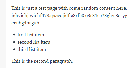
The theme’s css rules set lists further to the right compared to your screenshot. see image below

Are you using a page builder plugin to write your content? If you are, it looks like the plugin may have it’s own css rules that are overriding the theme style.
 AndyKeymaster
Hi Adri,
As a temporary fix, could you try adding this CSS and please let me know if this works for your site.
.woocommerce ul.products li.product:before, .woocommerce ul.products li.product:after, .woocommerce-page ul.products li.product:before, .woocommerce-page ul.products li.product:after{ content: ""; display: table; } AndyKeymaster
In your site I can see that you also have WP Fastest Cache plugin activated.
I suspect that the issue is due to the configuration settings of Speed Booster Pack or WP Fastest Cache plugin.
Have you asked the support of these two plugins? If so, what advice did they give?
 AndyKeymaster
Thank you for letting us know about this issue.
The theme did previously make use of imagesLoaded to only position the items after all images had loaded, but it didn’t work very well with the homepage product tabbed areas so we decided to not use it when we added masonry to the homepage tabs.
We tested it without and didn’t see any issues but I will of course look into the issue and see if we can fix it.
-
AuthorPosts
