Forum Replies Created
-
AuthorPosts
-
 AndyKeymaster
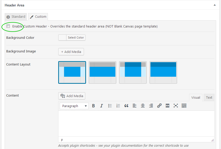
It is possible to use the custom header option and then leave it empty, so then it won’t show the header image and the page title and the page content will start immediately after the logo/menu area.
In the page editor go to the ‘Header Area’ and select the ‘Custom’ tab and select the checkbox for the ‘Enable Custom Header’ option. See attached image below which shows the custom header area in the page editor.
 AndyKeymaster
Hi Wim
The header image size should only be used as a guide and because it is a background image it will fill the header area, otherwise you could be left with gaps above/below or at the sides of the header area, depending on the space that it has to fill.
If your logo is large or if it is taller than it is wide, then the space that the header background image has to fill may be increased.
A couple of CSS styles that can be applied to the logo in Customize > Additional CSS:
This will remove all the margin space around the logo:
#site-branding .custom-logo {
    margin: 0;
}
As standard, the logo image is set to be a maximum width of 100% of the logo’s container area, so adding this CSS will tell the logo image to be a maximum width in pixels instead of 100% (change 120px to your desired value):
#site-branding img.custom-logo {
    max-width: 120px;
}
Hope this helps.
 AndyKeymaster
Hi Jan
Pro licenses are valid for 12 months and your license key expired 5 days ago.
The theme will still continue to work forever and is yours to keep forever, but you can only access updates with a valid license.
In case you wish to renew with a 25% discount, you can do so in your account or via the link in the reminder email that you should have received.
 AndyKeymaster
@media (min-width: 1200px) {
.container {
width: 1200px;
}
}
is in /wp-content/themes/global-disciples-child-theme/style.css on line 86.
The Trusted Pro theme also defines the container width as 1160px by default (this can be changed in the customizer settings though) so I’m not really sure why it is needed in the child theme too.
But in any case, the container element should not be used in the text area of each featured service as it is designed to set the width of the header, page content and footer container centered within the overall full-width view.
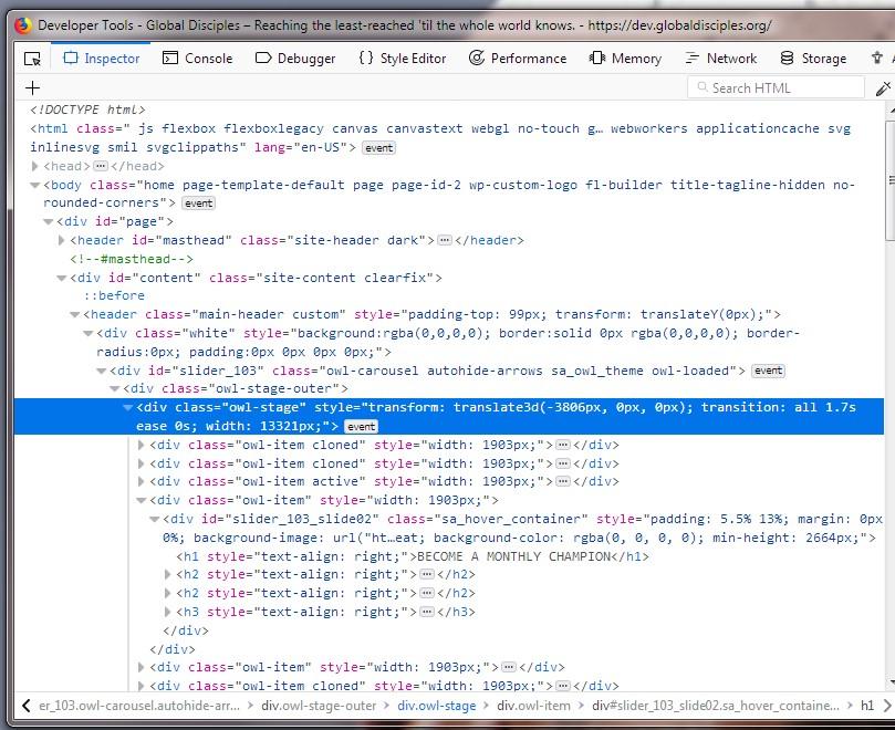
I think the main issue is the slider plugin is possibly set to display the slides in a horizontal carousel format rather than each slide sliding into/over the previous slide, so forcing the whole of the homepage to be a lot wider than it should. It’s not only Firefox, it is also the same in Chrome etc.
See the blue highlighted code in the screenshot below which shows how the overall width of the slider is 13321 pixels wide.
 AndyKeymaster
Also noticed that you have some custom code in your child theme that is inserting html code in each of the featured services text area, like so:
<div class="container">
<div class="row">
<div class="col-md-4 col-xs-12">
<div class="image-text-overlay text-middle-center" style=
        "background-image: url(/wp-content/uploads/2018/10/sharerect1.png);"></p>
<p>
            <span class="overlay-title">News & Stories</span>
                    </p>
<div class="overlay-white"></div>
</p></div>
</p></div>
</p></div>
</p></div>
</div>
This is not part of the Trusted Pro theme, and the custom CSS in your child theme is telling each
containerto be a minimum of 1200px wide, so all of these multiplied is also going to force this part of the content to be wider than most screens.The html markup above also has a lot of closing paragraph tags
</p>without any corresponding opening tag<p>. To be honest there are a lot of html/css errors in your custom child theme, so I would recommend asking the person who created your child theme to fix these. AndyKeymaster
There is nothing in the theme that would cause this problem.
Looking at your site, it seems the slider plugin “Slide Anything” that you are using in the header is forcing the page width to be 652729px wide!
Sorry, don’t know why this is because it is not our plugin and I am not familiar with that particular plugin. Does it have some settings that can be tweaked? Did you update this plugin at the same time, it could be something in the plugin that has changed from a previous version?The featured posts, page content and footer are there on the page, but you need to scroll across horizontally to see them in the center of the 652729px wide page.
 AndyKeymaster
To update Trusted Pro you simply activate your license key on your site(s) and then in your dashboard go to Appearance > Themes and click update theme.
November 9, 2018 at 1:08 pm in reply to: Consistent full screen Website display on all devices #6040 AndyKeymaster
We’re please to say that the latest versions of Exoplanet and Exoplanet Pro now feature the sticky footer as described in this support topic, and it works across all screen sizes too.
 AndyKeymaster
We’re pleased to say that the latest updates of both Trusted and Trusted Pro now have a ‘Recent Posts Section’ for the static homepage.
Trusted Pro has additional options of being able to change the number of posts displayed and the number posts per row (columns).
 AndyKeymaster
There is a way using CSS to ‘force’ the text to appear different to the actual text in the button.
Follow this example to change the button text of the first featured item (.featured-post1) to show the word HELLO
.featured-post1 .featured-readmore {
    font-size: 0;
    display: inline-block;
}

.featured-post1 .featured-readmore:before {
    content: "HELLO";
    font-size: 14px;
}
The second item would use
.featured-post2etc… AndyKeymaster
Hi Phillip
If I’m understanding correctly, this Additional CSS should do it:
#masthead.scrolled #site-branding { padding: 20px 0; } #masthead.scrolled #site-branding img { max-height: unset; } #masthead.scrolled #site-description { padding: 20px 0 0 0; } #masthead.scrolled .top-tel { padding: 5px 15px; } #masthead.scrolled #primary-menu li a, #primary-menu.scrolled li.menu-item-has-children a { padding-top: 10px; padding-bottom: 10px; } #masthead.scrolled .menu-item-has-children::after { top: 8px; } AndyKeymaster
Sorry, this theme does not support infinite scroll.
This theme has a masonry grid layout for the posts and we couldn’t get this to work 100% with infinite scrolling, so to avoid complications, we made a choice between supporting infinite scroll or losing the masonry layout.
If we can find a way to ensure 100% compatiblity it will be added in a future update. Hope this information helps.
 AndyKeymaster
Yes, when using the stacked/list (i.e. not the masonry/columns layout) layout, this is the design of the theme to use the large image size, as each post is full width.
You could make the images smaller with some Additional CSS like so:
article .entry-figure img {
width: auto;
max-height: 300px;
}
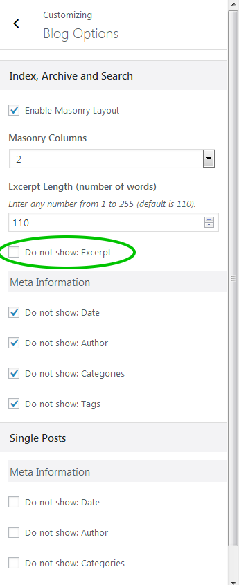
If the excerpt is missing, make sure that you have not selected the ‘Do not show: Excerpt’ option in Customize > Blog Options > Index, Archive and Search (see attached image below)
 AndyKeymaster
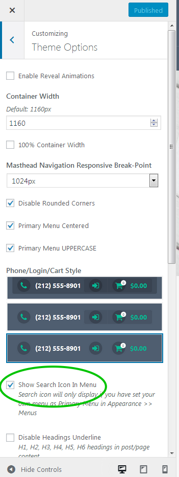
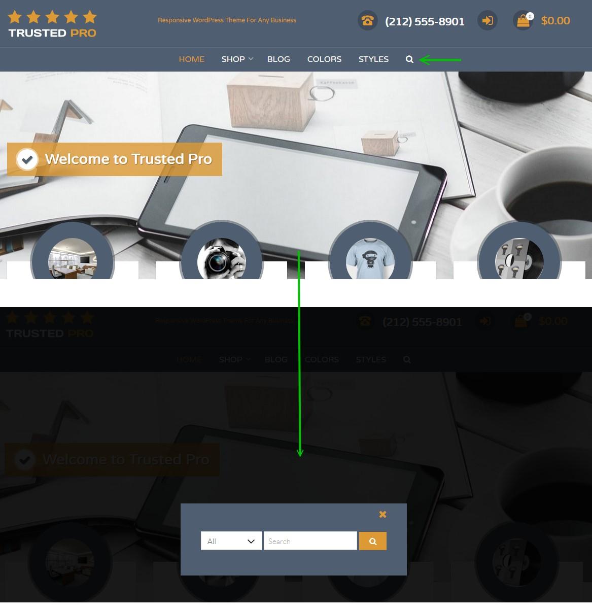
You need to activate the search function in the header menu. In your dashboard, navigate to ‘Appearance’ > ‘Customize’ > ‘Theme Options’ and check the box for ‘Show Search Icon In Menu’. See image below.
Then you will have the search function on your site. Click the search icon to bring up a large search box in the middle of the screen. See image below.
 AndyKeymaster
You don’t have to upload the featured image twice.
The featured image is displayed at the top of the single post page (if there is a featured image for that post).
In the source code for your site, I can see that you have added your own custom CSS which is hiding the featured image, so you may want to look at either removing or amending that custom CSS code.
-
AuthorPosts
