Forum Replies Created
-
AuthorPosts
-
 YazminKeymaster
Let me know the URL of the site please, and I’ll take a look see why this is happening.
 YazminKeymaster
It looks like the css may have been changed and the line height possibly removed.
.featured-post .featured-icon{
line-height: 80px;
}
the code above may fix it, or change 80px to a different value if you need to.
 YazminKeymaster
Hi Dora, the issue is because WordPress doesn’t handle sites changing from http to https very well at the moment.
It is fine if the site is https right from the start, but WordPress currently stores image links as absolute URLs, so for example an image uploaded when the site was http is stored in the WordPress database as http and if/when the site is changed to https the image URL is still only http.
The theme can only display content from WordPress, it is not allowed to make those changes, only plugins are allowed to do that.
So, we recommend installing the HTTP / HTTPS Remover plugin which converts all http to https and will fix the mixed content notice.
 YazminKeymaster
Thanks. I’ve looked at your site and the code is working correctly.
The mobile menu is now triggered at 768px width instead of the default 1024px.
768px is a good width to distinguish between mobile and tablet but, if you need the standard menu to stay on screen at less width, you can change the 768px value on this line:
@media screen and (max-width: 768px){ YazminKeymaster
Hi, your site is using WordPress version 4.1.19.
The theme requires WordPress at least version 4.4 or newer. You should update WordPress to the latest version which is currently 4.8.2.
To update to the latest version of WordPress, go to ‘Updates’ in your dashboard and below where it says “An updated version of WordPress is available.” click the ‘Update Now‘ button.
 YazminKeymaster
Tested the code on our demo and it worked. Can you let me know the URL of your site please and I’ll take a look and see why it doesn’t work on your site.
 YazminKeymaster
It is designed that way as some sites have a lot more than four menu items and we have to strike a balance at what screen width to display the mobile menu.
You can change the width at which the mobile menu is triggered with some custom CSS. Add this in Customize > Appearance > Additional CSS and let us know if this works better for your site.
@media screen and (max-width: 1024px){ .toggle-nav{ display: none; } #primary-menu { text-align: left; height: auto; position: relative; right: auto; padding-top: 0; width: 80%; } #primary-menu li{ width: auto; float: right; } } @media screen and (max-width: 768px){ .toggle-nav{ display: block; position: absolute; top: 0; right: 0; z-index: 1000; width: 47px; height: 47px; } #primary-menu{ background: #fff; text-align: left; height: 100vh; overflow: auto; position: fixed; right: -250px; padding-top: 50px; width: 250px; z-index: 100; } #primary-menu li{ width: 100%; } } YazminKeymaster
There won’t be any menu items to see on the live site as there are no items added to the menu.
But I can see that you are trying to add pages to the menu and it lags with no pages being added.
In the screenshot it looks like you are using a caching plugin, so the first thing to try would be to deactivate that plugin and then see if you are able to add pages to the menu.
October 20, 2017 at 7:05 pm in reply to: How to get rid of the shopping cart icon, price and the "body outline" on top #2373 YazminKeymaster
Firstly, is your site e-commerce? Are you using WooCommerce on your site?
Those icons and the cart/basket total only display when you have WooCommerce plugin installed and activated.
 YazminKeymaster
Sorry, no, the theme does not have a slider.
 YazminKeymaster
Hi,
Navigate to Appearance > Widgets, and you will see the ‘Copyright Area’ widget area.
Drag and drop any of your available widgets (Text, Image, Custom HTML etc..) into the Copyright Area, and add/write your content as appropriate.
When there is at least one widget in the Copyright Area it will remove the ‘powered by WordPress…’ and display your content in it’s place.
 YazminKeymaster
Thank you for using the Trusted theme.
This can be done with custom CSS (Customize > Additional CSS):
/* remove icon of 1st featured service */
.featured-post1 .featured-icon .fa:before {
content: "";
}

/* replace icon with own image */
.featured-post1 .featured-icon .fa {
background: url('image-url');
width: 40px;
height: 40px;
background-size: cover;
}
Or you could upgrade to Trusted Pro which has the option to quickly and easily add your own images in place of the icons in the customizer.
 YazminKeymaster
One way to achieve this would be with a plugin such as Custom Background Changer or Full Background Manager which should let you set a different background image per page or post.
It can also be done with some custom CSS, so if these plugins are not suitable, let me know and we’ll try to help with this.
October 16, 2017 at 7:03 pm in reply to: Header Image – Sitewide and per page/post/product etc #2324 YazminKeymaster
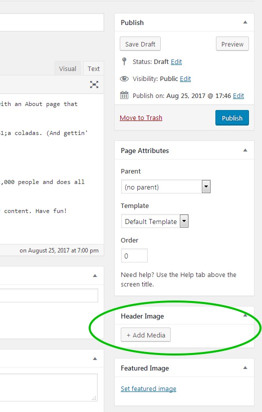
If you navigate to ‘Posts’, ‘Pages’ or ‘Products’ in your dashboard and click ‘Edit’ to edit a post/page/product, you will see the extra ‘Header Image’ section to the right of the main content area and below the ‘Page Attributes’ section (below ‘Tags’ in post editor and below ‘Product Tags’ in product editor).
Here you can upload an image to use as the header image for that page/post/product.

 YazminKeymaster
Yes, to set all to same height (length) add this in Additional CSS (changing 300px to your chosen height in pixels):
#featured-post-section .featured-post {
height: 300px;
}
or to set height of individual columns (.featured-post2 is the 2nd column etc..):
#featured-post-section .featured-post2 { height: 300px; } #featured-post-section .featured-post3 { height: 350px; } -
AuthorPosts
