Forum Replies Created
-
AuthorPosts
-
 AndyKeymaster
“How do I do the: 1:1 ‘Thumbnail cropping’?”
Select the 1:1 option below where it says “Thumbnail Cropping”.
There is more information about this in the WooCommerce documentation.
 AndyKeymaster
From what you have described, it sounds like a plugin conflict.
Recommend that you deactivate all your active plugins, and try the customizer again.
If it works, then reactivate your plugins one at a time until the problem reappears.
You will then know which plugin (if any) is causing the problem.If the problem persists even with all plugins deactivated, please let me know.
 AndyKeymaster
To change the text font of the product category titles in your screenshot, go to Customize > Typography & Fonts and change the ‘Headings’ font.
The font size, weight, and transform (uppercase, lowercase, capitalize, none) for the product category titles can be changed at Typography & Fonts > Product Archives > Category Title
 AndyKeymaster
You just need to change the image size to a suitable size at Customize > WooCommerce > Product Images
change the ‘Thumbnail Width’ to an appropriate size, so for example if you have 3 products per row then the thumbnail width would need to be larger than if you are displaying 6 products per row.
But, if a suitable width would be 400px for example, and your original images are only 350px width then they will of course appear low quality because they are being resized upwards.
Also, if you have a mixture of images that are tall and narrow and others that are more square, then you can try the 1:1 ‘Thumbnail cropping’ which will crop images into a square shape.
 AndyKeymaster
Change the WooCommerce image size to a suitable size for your images.
There is no one-size-fits-all as every website is different and everyone will have different product images available.
A good idea is to plan your images in advance for a consistent design. The tall images could be resized to fit the same dimensions as the majority of your other product images before uploading it to your website.
 AndyKeymaster
The theme only displays the cart quantity provided by the WooCommerce
get_cart_contents_countfunction.Looking at the WooCommerce php files, this is the full function:
public function get_cart_contents_count() {
    return apply_filters( 'woocommerce_cart_contents_count', array_sum( wp_list_pluck( $this->get_cart(), 'quantity' ) ) );
}
This function is filterable with the
woocommerce_cart_contents_countfilter, which means that you can create your own function to output a number based on your own formula, like so:function tronds_cart_quantity() { /* your formula/calculations of cart quantity here */ } add_filter( 'woocommerce_cart_contents_count', 'tronds_cart_quantity' );Any php functions such as this should be added to the functions.php file of a child theme.
 AndyKeymaster
The widgets in the top bar are automatically 50/50 left/right on larger screens.
If you add an empty text widget before your menu widget, this will make the menu appear to the top right.For the new window option, click ‘Screen Options’ in the top right of the widgets page, and make sure to select the ‘Link Target’ option under the ‘Show advanced menu properties’ heading.
 AndyKeymaster
Hi Joanna
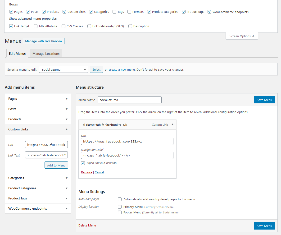
The best way is to use a widget.
First create a new menu, give the menu a name, leaving the ‘Display location’ options unchecked.
Add your social media links to the menu using the ‘Custom Links’ option.
In the ‘Link text’ enter this code:
<i class="fab fa-facebook"></i>
…for twitter, instagram etc replace facebook as appropriate.To have the link open in a new tab, select the ‘Open link in a new tab’ option.
Save the menu.
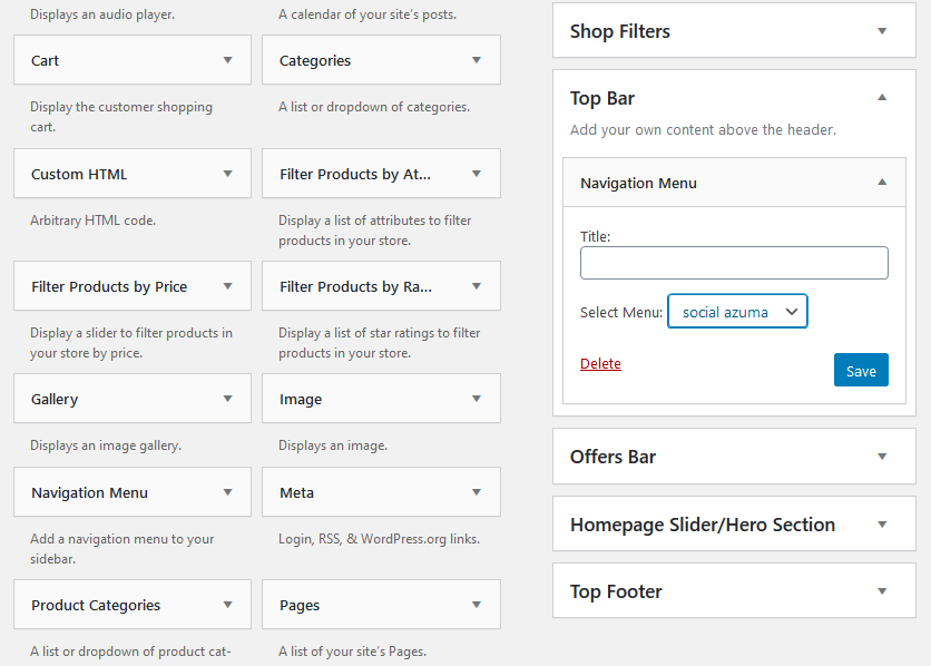
Now go to the Widgets area and add a ‘Navigation Menu’ widget to the ‘Top Bar’ widget area.
Select the menu you created earlier and save the widget.Your social media links with icons will now be displayed in the top bar.
See the screenshots below.


 AndyKeymaster
The search button to the right or below depends on how much available space there is for the text input and button to be able to display inline. When I view your site the button is below the text input on Firefox and Chrome.
You can give the text input a maximum width so there is enough available space to display the button to the right.
e.g.
#shop-filters input[type="search"] { max-width: 190px; } AndyKeymaster
Please add this CSS snippet to ‘Appearance’ > ‘Customize’ > ‘Addtional CSS’:
.toggle-nav { width: 4em; font-size: 1em; } .toggle-nav::before, .toggle-nav.menu-open::before { content: "menu"; font-weight: normal; font-family: inherit; } AndyKeymaster
Hi Frederik,
Thanks for the screenshots, that really helped.
Could you please remove the previous CSS I gave you, and replace with this:
.shop-filter-wrap .shop-filter-toggle {
    display: none;
}

.shop-filter-wrap #shop-filters {
    display: table;
}

#shop-filters {
    font-size: 100%;
}

.select2-container .select2-selection--single {
    height: auto !important;
    margin-top: 2px !important;
}

.select2-container--default .select2-selection--single {
    border-radius: 2px !important;
    border-width: 0 !important;
}

.select2-container--default .select2-selection--single .select2-selection__rendered {
    padding: .618em 1em !important;
    line-height: 1.4 !important;
}

.select2-container--default .select2-selection--single .select2-selection__arrow {
    top: 10px !important;
}

#shop-filters form {
    max-width: 100%;
}

#shop-filters input[type="search"] {
    border-width: 0;
    -moz-appearance: none;
    -webkit-appearance: none;
}

#shop-filters button {
    padding: .618em 1em;
    line-height: 1.4;
    height: auto;
    -moz-appearance: none;
    -webkit-appearance: none;
}
This amended code should work now. If not, please let me know.
 AndyKeymaster
Would you be able to add the first bit of CSS again, so I can take a look and work out a solution?
 AndyKeymaster
Also, this will make the search box and button look better:
#shop-filters form { max-width: 100%; } #shop-filters button { padding: .718em 1em; line-height: 1.4; height: auto; } AndyKeymaster
This should make the WooCommerce dropdown same size as search box:
#shop-filters { font-size: 100%; } .select2-container .select2-selection--single { height: auto; margin-top: 2px; } .select2-container--default .select2-selection--single { border-radius: 3px; border-width: 0; } .select2-container--default .select2-selection--single .select2-selection__rendered { padding: .718em 1em; } .select2-container--default .select2-selection--single .select2-selection__arrow { top: 10px; } AndyKeymaster
Add this to Additional CSS:
.shop-filter-wrap .shop-filter-toggle {
    display: none;
}

.shop-filter-wrap #shop-filters {
    display: table;
}
This will hide the dropdown toggle, and make the widget area visible at all times.
-
AuthorPosts
