Forum Replies Created
-
AuthorPosts
-
 AndyKeymaster
On your website I can see that you are currently running version 1.0.7 of Trusted Pro which is more than 1 year out of date, so you should update to the latest version of Trusted Pro.
For future reference, you can view the theme’s changelog by clicking the ‘Show Change Log’ on the Trusted Pro product page.
You can also activate your license key to be able to see Trusted Pro theme updates in your site dashboard.
 AndyKeymaster
Do you have the newest version of Trusted Pro? (currently version 1.3)
Do you have the newest version of WooCommerce? (currently version 3.5.0)
If not, please update both to latest versions.
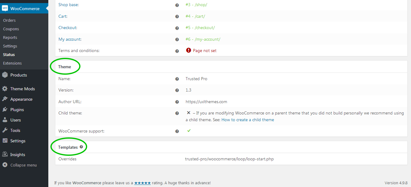
If yes, please navigate to ‘WooCommerce’ > ‘Status’ and let me know the information presented under the ‘Theme’ and ‘Templates’ headings. It should look like in this attached image

 AndyKeymaster
No worries. Thanks for updating and letting us know.
 AndyKeymaster
No, the theme will not override the continue to checkout button on the cart page.
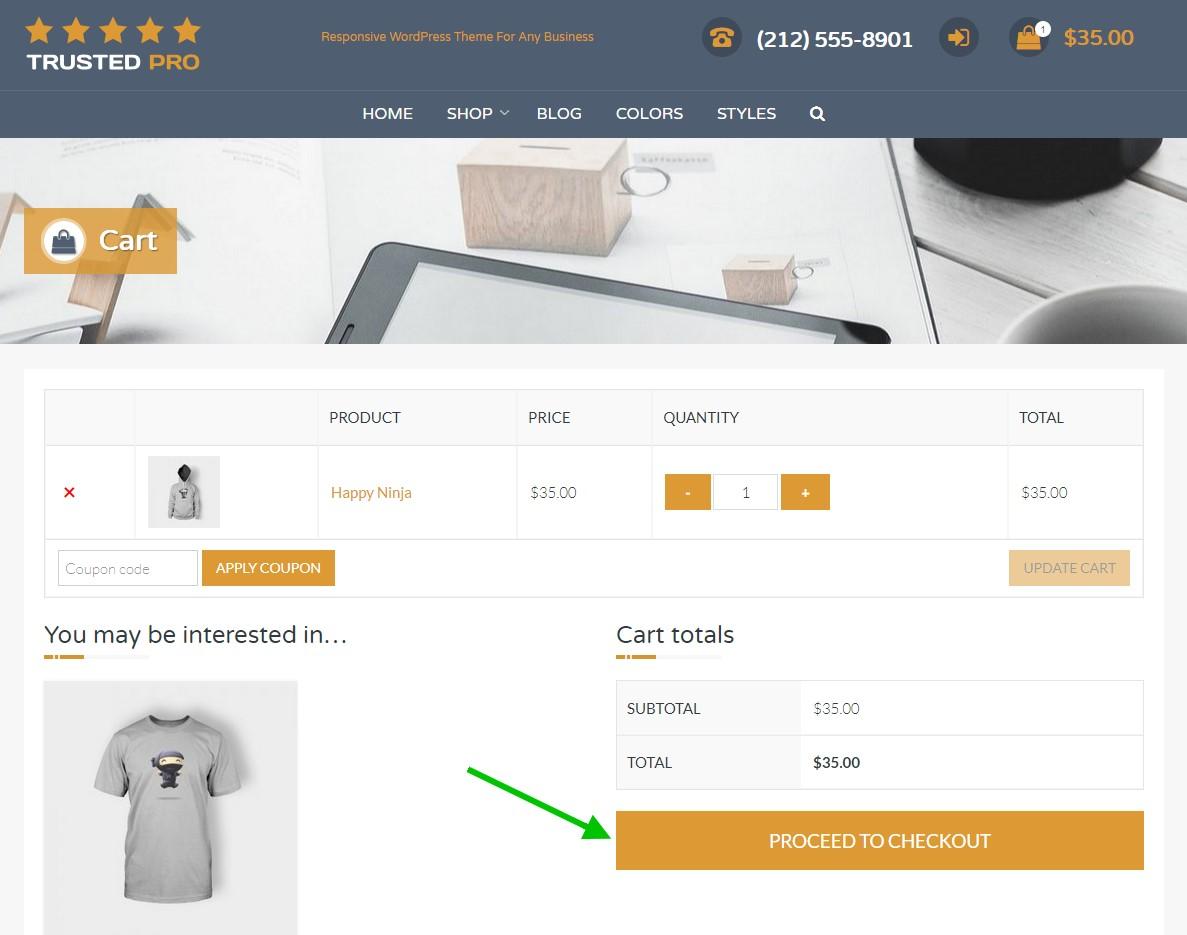
I have attached an image which shows the ‘PROCEED TO CHECKOUT’ button on our Trusted Pro demo site.
So that I am sure of being on the right page with the issue on your site, is it the button marked with a green arrow that is missing on your site?
 AndyKeymaster
This Additional CSS should do it:
@media screen and (min-width: 321px){

    #site-branding {
        padding-top: 10px
        padding-bottom: 10px;
    }

    #site-description,
    #masthead.style2 #site-description,
    #masthead.style3 #site-description {
        padding-top: 10px
        padding-bottom: 10px;
    }

    .top-tel,
    #masthead.style2 .top-tel,
    #masthead.style3 .top-tel {
        padding-top: 0;
    }

}
These are the padding values when scrolling, applied to screens wider than 320px when not scrolled (on initial page load).
 AndyKeymaster
There isn’t a simple way without using a plugin, but I’ll see if it is possible to add this as an additional optional section in the theme’s ‘Static Homepage Options’ for a future update.
October 19, 2018 at 8:13 pm in reply to: Consistent full screen Website display on all devices #5911 AndyKeymaster
Thanks for getting back to me and letting me know it works.
If you notice some weird behavior on smaller screens, you may need to also add this snippet of CSS
@media screen and (max-width: 1120px) {
    #page {
        display: block;
    }
    #colophon {
        display: block;
        height: auto;
    }
}
October 18, 2018 at 4:36 pm in reply to: Consistent full screen Website display on all devices #5905 AndyKeymaster
Hello Fred, after giving this much thought, we think we know what the issue is. Please correct me if we have this wrong.
The Exoplanet theme displays the footer immediately after the end of the page content, but you are looking to peg the footer to the absolute bottom of the screen, even when the page content is minimal or with not so much height, so you would see white space between the page content and the footer.
To accomplish this, can you please try adding the following to Customize > Additional CSS:
html, body {
    height: 100%;
}
#page {
    display: table;
    width: 100%;
    height: 100%;
}
#content {
    height: auto;
}
#colophon {
    display: table-row;
    height: 1px;
}
Please let me know whether this works or not.
Andy
 AndyKeymaster
This is by design. The about us section will first look for an ‘Excerpt’ of the selected page. If the excerpt is empty it will display the first 110 words from the selected page’s main content with the formatting removed to avoid issues if the cut-off was in the middle of a [shortcode] or other formatting such as a link or heading etc.
The content is designed to be used as a preview or lead-in to the selected page, with the image or the ‘Read More’ button providing a click-thru to the selected page. It is also recommended to write an excerpt to avoid duplicate content.
The page excerpt will be displayed as-is with formatting intact as it does not have a 110 word cut-off.
If you are not familiar with HTML markup/formatting you could use the main content area to write your formatted excerpt, then switch the editor from ‘Visual’ to ‘Text’ view and cut & paste the content into the ‘Excerpt’ text box.
 AndyKeymaster
Placing the shopping cart within the product description is beyond the scope of minor CSS modifications and help with the theme’s functionality.
It would require custom coding of the WooCommerce plugin functionality, and an option would maybe find a reputable freelance coder on Upwork for this kind of bespoke service.
 AndyKeymaster
Hello Richard, we tried to simplify the sizing option into one setting, so to change this you would need to add some custom CSS and start with a desired width for the outer circle and then use this to work out the sizing and positioning of the inner circle and the icon/image size.
For example, if you want the outer circle to be 160px x 160px, the theme would calculate and use this CSS:
.featured-post .featured-icon {
    width: 160px; /*outer circle width*/
    height: 160px; /*outer circle height*/
    font-size: 80px; /*inner icon size*/
    line-height: 156px; /*line height for the icon font, 4px less than outer circle because border is 2px thickness top & bottom*/
    margin-top: -98px; /*positioning of outer circle on the top of outer box*/
}

.featured-post .featured-icon img {
    width: 96px; /*width of image when using image instead of icon*/
    margin-top: 32px; /*vertical positioning of image within outer circle*/
}
The comments wrapped with /**/ are there as a guide to show what each value represents.
Feel free to change any or all of the values in the above CSS to achieve the look you want and write it to ‘Customize’ > ‘Additional CSS’
 AndyKeymaster
Hi Phil, sorry Yazmin is covering the weekend this week so if I may answer, the functionality you are looking to achieve would be beyond the scope of minor CSS modifications and help with the theme.
It would require custom coding and testing, and an option would maybe find a reputable freelance coder on Upwork for this kind of custom service.
 AndyKeymaster
Please add this CSS to Customize > Additional CSS:
.trusted-modal {
    z-index: 200;
}
Let me know if that fixes your issue.
 AndyKeymaster
OK, I don’t really understand why you would add an excerpt to a page and then hide it with CSS, but anyway here is the CSS code to hide the page excerpt – add this to Customize > Additional CSS:
.main-excerpt {
    display: none;
}
There shouldn’t be a sizing issue as the above CSS will make the excerpt area appear to be not there so it will have zero height and zero width.
 AndyKeymaster
The correct way to do this is to leave the excerpt empty on those pages where you do not want to display an excerpt.
I hope I have understood your question correctly. Please correct me if not.
-
AuthorPosts
