Forum Replies Created
-
AuthorPosts
-
 AndyKeymaster
To add a secondary menu into the theme, you will need to create a child theme, copy the code from the parent theme’s (Ibsen Pro) header.php file to a file with the same name in the child theme, and then add additional code for a secondary menu in the child theme’s header.php file.
 AndyKeymaster
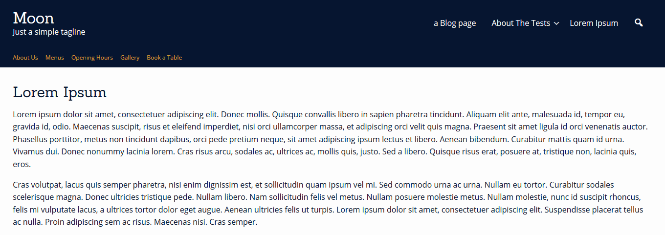
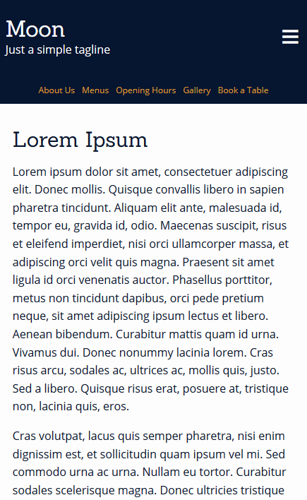
This is what it looks like when I tried the top bar menu.
It works across mobile and larger devices, and the menu color/spacing/text size etc can all be customized with some custom CSS styling.
Laptop view

Mobile view

 AndyKeymaster
One option would be to add a ‘Navigation Menu’ widget to the ‘Top Bar’ widget area.
This would display a secondary menu in the top bar above the logo/site title/main menu area.
If you want the top bar menu to display below the logo/main menu area, add this custom CSS to ‘Customize’ > ‘Additional CSS’:
#masthead { display: flex; flex-direction: column-reverse; } AndyKeymaster
I’ve looked at your website and I can’t see any problems with the links or buttons, so I don’t understand the issue.
You say that you cannot click on the buttons, and you have to refresh the page first before the buttons will react.
Sorry, I don’t see any of these problems when viewing the site on PC, android or iphone.To answer the PHP question, yes the theme is OK with PHP 7.4.
 AndyKeymaster
Yes, Trusted Pro 1.8 is compatible with WordPress 5.6 and also WooCommerce 4.8.
Can you please let me know a page URL where the problem with the links/button can be seen, and I’ll be able to take a look and advise further.
 AndyKeymaster
Thank you for getting back to me and letting us know about the starter site content.
 AndyKeymaster
To remove this section, add this to ‘Additonal CSS’:
.single .entry-footer {
    display: none;
}
December 14, 2020 at 11:41 am in reply to: Hello, Suddenly, the articles and pages layout has changed. #12964 AndyKeymaster
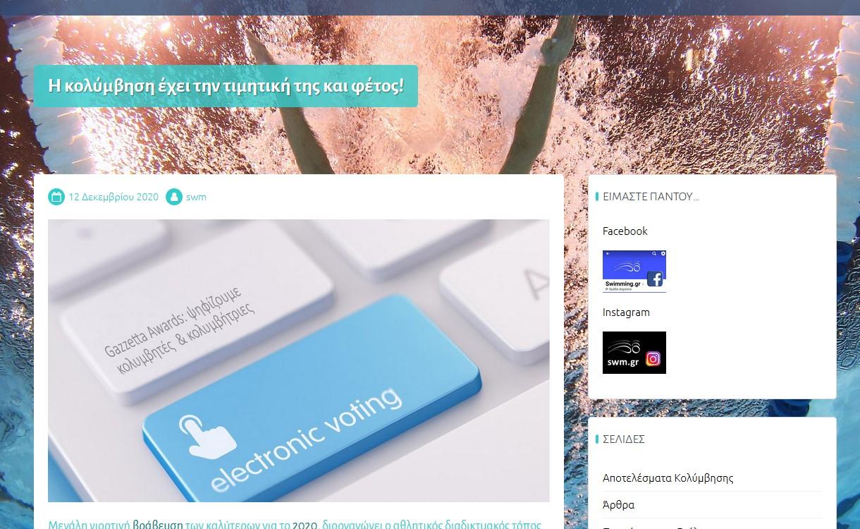
When I view the articles and pages on your site, it looks OK with the correct space, please see screenshot below.

Does it still look wrong when you view the articles?
If so, please try clearing your browser cache and refresh the page to see if you had old styling cached in your browser. AndyKeymaster
For the best image size, I would say it is a matter of personal preference, but I would say you could look at using an image with a narrower width in relation to the height for smaller devices such as phones.
Then use a media query in custom CSS to use the alternative image on mobile only, like so:
@media (max-width: 768px) { body.custom-background { background-image: url('my-image-url-alt-phone'); } } AndyKeymaster
Are you able to delete your menus and then create and save a new menu? Or does this still not save?
If you have database access, you could try deleting the Cordero Pro theme mods entry, so forcing a reset.
DELETE FROM wp_options WHERE option_name = 'theme_mods_cordero-pro'If any of these fail, please let me know which starter site content you imported. If more than one, please let me know in which order they were imported.
Thanks.
 AndyKeymaster
On an iPhone in portrait orientation, iOS overrides the styling to position the background image how it thinks it will look best.
So, there are no changes to the CSS that can be done to prevent this, as iOS will always override it.
 AndyKeymaster
The
<head>and<body>tags are located in header.php and also header-blank-canvas.php, header-landing-page.php, and header-transparent.php.These are the header templates that correspond to the various page templates. header.php is the default site-wide template used across the site, unless a page is set as one of the other page templates, in which case the relevant header file will be used. These are the only files containing
<head>and<body>tags.Rather than manually editing these header files, you can hook into the
wp_head()function and thewp_body_openaction in the functions.php file of your child theme, or use a plugin such as Google Tag Manager for WordPress that will do this for you. AndyKeymaster
It looks like you are using the
trusted_featured_services()PHP function in a child theme, to override the functionality of the parent theme.When changing/using this function, it requires that exactly 1 parameter (the missing argument in the error) is passed to the function.
So for example, this will NOT work as there is no parameter:
trusted_featured_services() {
    /* your custom code */
}
This will work and is correct as there is a parameter passed to the function:
trusted_featured_services(1) {
    /* your custom code */
}
The parameter in the working example above “1” refers to the number of the order in which you have set the various homepage sections.
For example if you have the featured services section in first place before the other homepage sections, use the value “1”, and if it is in position 3, then use the value “3”.
 AndyKeymaster
The design of this particular theme is that there is a theme generated “Read More” link when there is no manually added excerpt, or when the auto-generated excerpt is cropped from post content that is longer than the defined 110 words excerpt length.
When a post has a manually added excerpt, or when the auto-generated excerpt is taken from post content that is already shorter than the defined excerpt length (no need to crop the content shorter in this instance), then the “Read More” link is not present.
There is however a default WordPress “Continue Reading” link that is hidden from view by the theme, but is left in place in case anyone wants to make it visible.
The custom CSS to make this visible is like so:a.more-tag { display: block; } AndyKeymaster
Please use the following snippets of custom CSS, added at ‘Customize’ > ‘Additional CSS’.
Move mobile menu (burger icon) to the right:
@media (max-width: 1024px) {
    .toggle-nav {
        left: auto;
        right: 10px;
    }

    #page.is-visible #primary-menu,
    #masthead.is-visible #primary-menu {
        left: auto;
        right: 0;
    }

    #page.is-visible {
        left: 0;
    }

    #masthead #site-top-right {
        padding-right: 40px;
    }

    #masthead #site-top-left {
        padding-left: 0;
    }
}
Fix close menu position:
.toggle-nav.is-visible {
    top: 15px !important;
}
Fix close menu icon color:
.toggle-nav.is-visible .menu-icon { color: #fff; } -
AuthorPosts
