Forum Replies Created
-
AuthorPosts
-
 AndyKeymaster
So that I can hopefully fully answer your question, could you please provide more information.
Are you wanting to add a custom font so that it is selectable in the Typography section of the customizer?
If so, is it a Google font that is not currently in the available options?
Or is it a font that you have the files of, and want to add it in the mix with the Google fonts options?Or do you want to override the theme fonts with your own font?
Do you have the files (.ttf .woff. eot etc..) for the font you wish to use?
 AndyKeymaster
For now I would recommend you remove the additional CSS code relating to the navigation menu and site title, and wait for our planned update that will have options to change the break-point for mobile menu that I mentioned previously.
Of course if you are finding the theme is not suitable for your needs, we do offer a 30 day money back policy. If you decide you would like a refund please let me know and I’ll issue it right away.
 AndyKeymaster
1. the site title is 20% on desktop and menu area is 80%. Change them like this:
@media screen and (min-width: 1025px){
    #site-branding{
        width: 20%;
    }
    .site-navigation{
        width: 80%;
    }
}
this assumes not using the modified css from before to make the mobile menu only appear at a narrower width, so in your case you could use this:
@media screen and (min-width: 769px){
    #site-branding{
        width: 20%;
    }
    .site-navigation{
        width: 80%;
    }
}
2. not at the moment no sorry it is quite a major change to get that to work how you want it. Please wait for the next update which will have option to change the break-point for mobile menu.
3. this can be changed by changing the padding at top and bottom of the page title area:
.header-title {
    padding-top: 70px;
    padding-bottom: 70px;
}
the code above will format it on all screen widths, to change it on mobile only use this:
@media screen and (max-width: 768px){
    .header-title {
        padding-top: 70px;
        padding-bottom: 70px;
    }
}
We’re happy to help with minor CSS modifications but if you are going to be changing a lot of the formatting I would very much recommend looking into using browser inspection tools which you could use to find the right elements to modify. See the links below for more information.
November 16, 2017 at 1:18 pm in reply to: Register link is (in my case) pointing to wrong page. #2791 AndyKeymaster
You can also make the link URL translatable to have it point to different location based on language like this
<a href="<?php _e( 'http://my-domain.dev/user-registration', 'trusted' );?>"><?php esc_html_e( 'User Registration', 'trusted' );?></a>November 16, 2017 at 1:14 pm in reply to: Register link is (in my case) pointing to wrong page. #2790 AndyKeymaster
There are two lines where it needs changing. Lines 946 and 978.
One is for when no telephone number present in the header and the other for when it is.
Sorry about that, my mistake.November 16, 2017 at 12:52 pm in reply to: Register link is (in my case) pointing to wrong page. #2788 AndyKeymaster
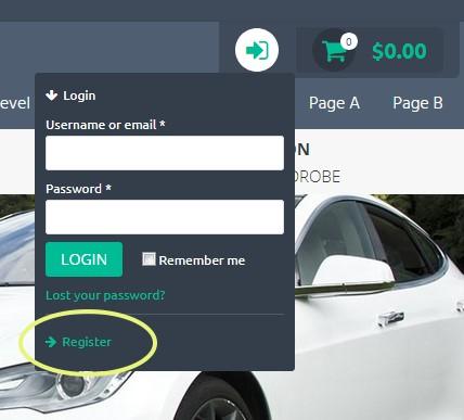
Am I understanding correctly that it is the register link in the header that you want to change?
See image below November 16, 2017 at 12:46 pm in reply to: Register link is (in my case) pointing to wrong page. #2786
 AndyKeymaster
if you are also changing the text, you can use this to make ‘User Registration’ a translatable string:
<a href="http://my-domain.dev/user-registration"><?php esc_html_e( 'User Registration', 'trusted' );?></a>November 16, 2017 at 12:33 pm in reply to: Register link is (in my case) pointing to wrong page. #2784 AndyKeymaster
Sorry we’re missing the text for the link, so should be something like this:
<a href="http://my-domain.dev/user-registration"><?php echo $woo_account_reg_title;?></a>
or this:
<a href="http://my-domain.dev/user-registration">User Registration</a>November 16, 2017 at 11:07 am in reply to: Register link is (in my case) pointing to wrong page. #2779 AndyKeymaster
Yopu could copy the
trusted_tel_login_cart()function (line 844 to line 1052 in extras.php) into your child theme functions.php file, and change the part where the ‘Register’ link is found.On line 946 change this part:
<a href="<?php echo $woo_account_page_url;?>"><?php echo $woo_account_reg_title;?></a>to something like this:
<a href="http://www.mywebsite.com/my-registration-page/"></a>PS to write code into a forum post, switch from Visual tab to Text tab and you can wrap the code with code tags using the ‘code’ button.
 AndyKeymaster
Sorry for the delay in replying to you. We missed this thread somehow!
Regarding the mobile menu, it looks like it is not so simple to change the width at which the mobile menu appears instead of the desktop menu, so the CSS I supplied previously won’t work fully as intended as the theme was not designed with this in mind.
Going forward we are looking at adding functionality to a future update that will allow you to select when the mobile/dektop menu appears.
 AndyKeymaster
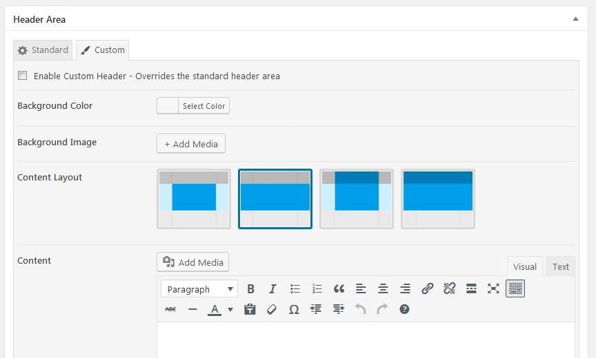
The custom header overrides the standard header settings, so it doesn’t have the scrolling effect.
It is a custom area for you to add your own content/effects/plugin/slider etc etc.. AndyKeymaster
Just checked your site and your slider is full width, so I assume you have found the layout setting and adjusted it accordingly.
See the four images available to select for the content layout

PS don’t worry about the
<p></p>paragraph tags as they are automatically stripped out if there is a shortcode in use. AndyKeymaster
This issue was caused by two incorrectly formatted child themes that were conflicting with each other and with the parent theme.
We recommend using our Child Themes which are tested to work correctly with our parent themes.
The child themes can be used as they are, or you are free to download and rename the child theme to your own chosen theme name, but please keep the structure of the way they work with the parent theme intact or it may not work correctly.
 AndyKeymaster
The header background image does not have a definitive fixed size.
It is a background image that fills the header area.
The size – and the width/height ratio – of the header area will vary depending on the size of the screen, so the background image will cover that area without stretching the image. This does mean that sometimes either the top/bottom or the sides may be “cut off”.
If it didn’t “cut off”, the background image would either have to strech to cover the height or the width or to avoid stretching it would be cut short and you would have empty space at the top/bottom or the sides.
I hope this helps to explain how the header background image works.
 AndyKeymaster
Sorry forgot to say that it is possible your browser has cached the old version’s stylesheet. The new version has extra formatting to work with the masonry layout.
Can you try opening your site in a new private/incognito window, or clear your browser cache, or logout of your WP admin close the browser and login again.
-
AuthorPosts
